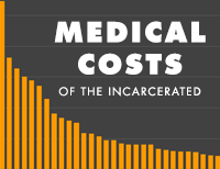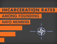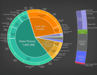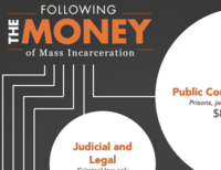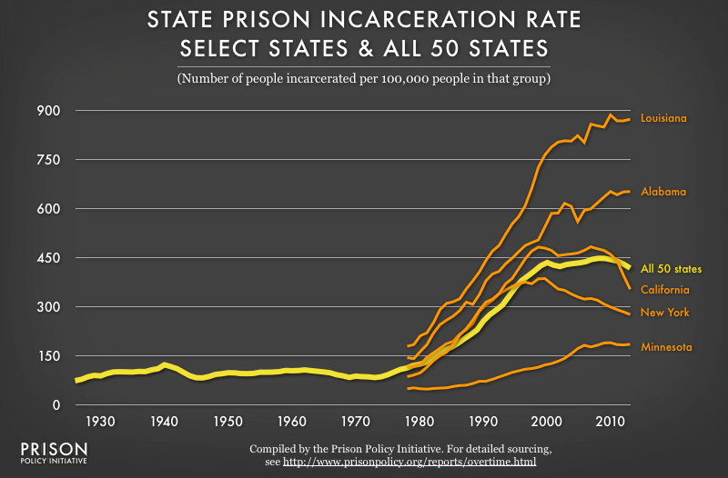
Data Source: For detailed sourcing, see http://www.prisonpolicy.org/reports/overtime.html#select50. (Graph: Peter Wagner, 2014)
This graph originally appeared in Tracking State Prison Growth in 50 States.
Events
- November 13-15, 2024:
Members of our Research and Advocacy teams will be attending the American Society of Criminology annual meeting in San Francisco from November 13 through the 15th. Please reach out if you’d like to set up a meeting. - November 14-16, 2024:
Members of our Research and Advocacy teams will be attending a convening at the University of Texas in Austin from November 14 through the 16th. Please reach out if you’d like to set up a meeting.
Not near you?
Invite us to your city, college or organization.
