Our favorite data visualizations of 2017
2017 was another big year for powerful data visualizations from the Prison Policy Initiative. These are our 9 favorites.
by Peter Wagner, December 29, 2017
2017 was another big year for powerful data visualizations from the Prison Policy Initiative. These are 9 of our favorites:
1. The “whole pie”
We updated our most famous data visualization for 2017, Mass Incarceration: The Whole Pie:
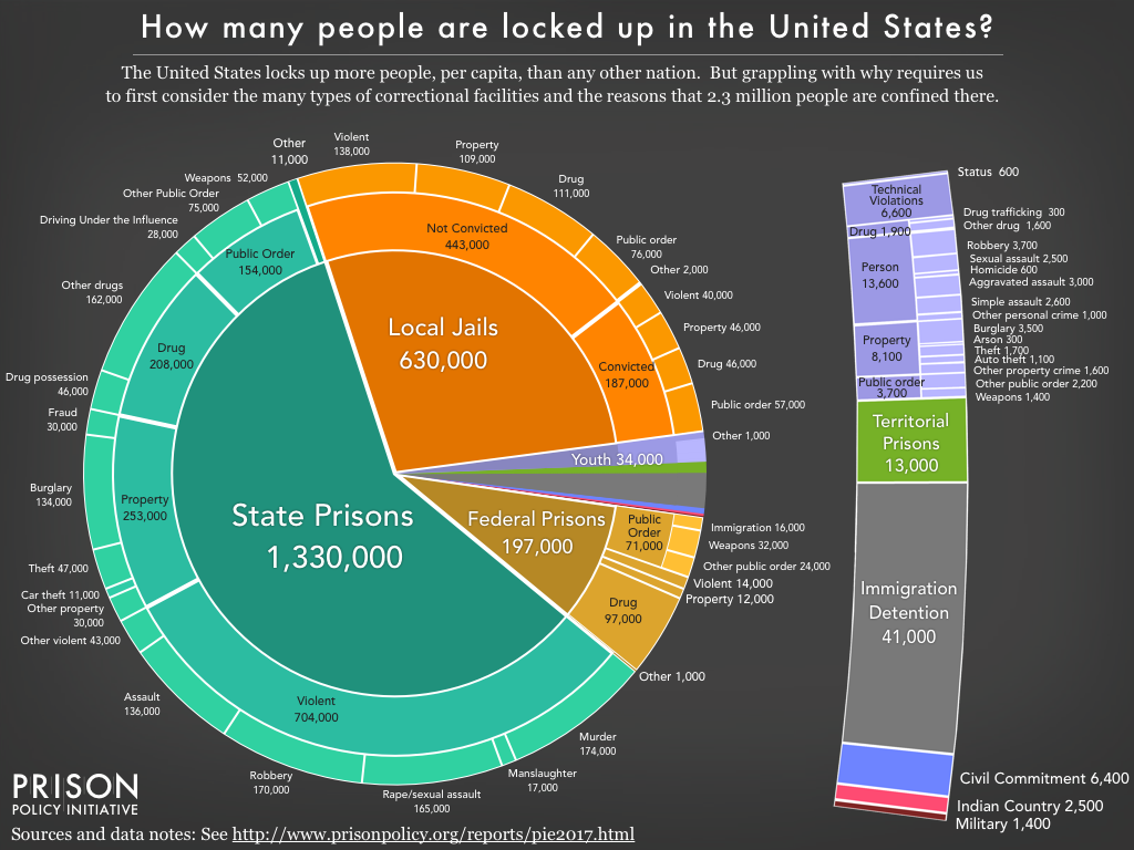
This report also included four slideshows of additional detail on different parts of the carceral system — including the under-discussed world of jails — and some state-to-state comparisons.
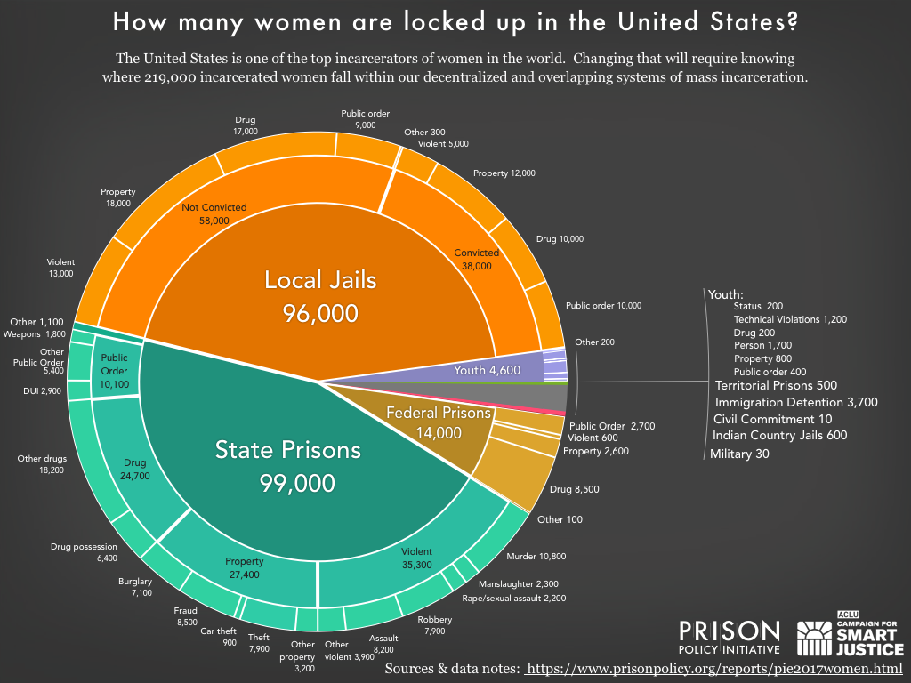
2. The “whole pie” of women’s incarceration
In partnership with the ACLU, we produced Women’s Mass Incarceration: The Whole Pie to aggregate the disparate systems of confinement and illustrates where and why 219,000 women are locked up in the U.S.:
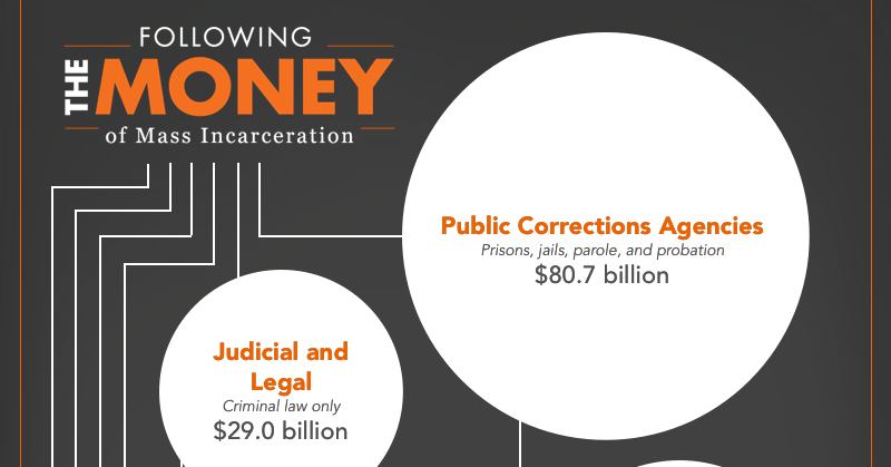
3. Following the money of mass incarceration
In the first-of-its-kind report accompanying this graphic, we find that the system of mass incarceration costs the government and families of justice-involved people at least $182 billion every year. In this report and visualization, we follow the money:
 Please click to see the full visualization.
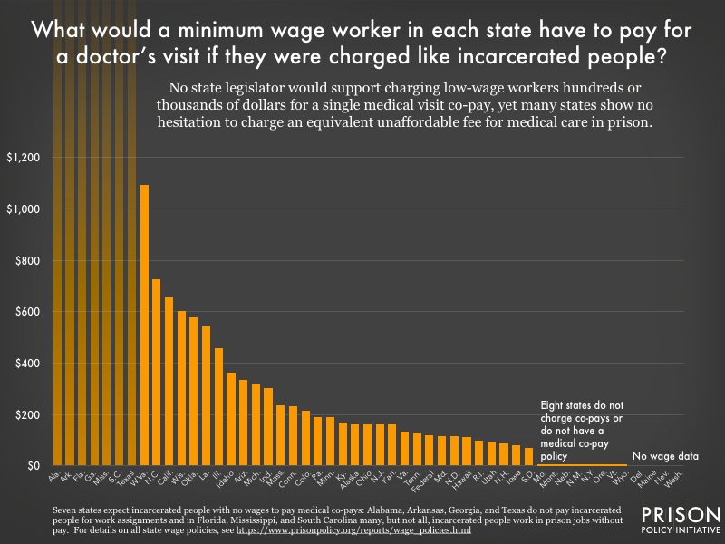
4. The short-sighted cruelty of charging incarcerated people high fees for their own medical care
If your doctor charged a $500 co-pay for every visit, how bad would your health have to get before you made an appointment? You would be right to think such a high cost exploitative, and your neighbors would be right to fear that it would discourage you from getting the care you need for preventable problems. In a 50-state analysis of medical co-pays in prison, we find that this is the hidden reality of prison life:
5. Putting the emphasis of criminal justice reform where it belongs: on state and local policies
The federal government gets all the attention, but the real story of mass incarceration is at the state and local levels. We’ve been continuing to update this key visual:
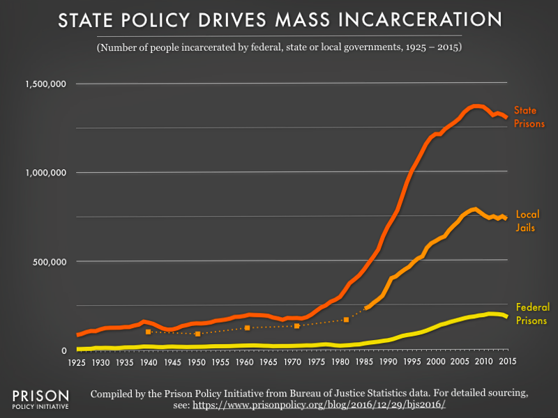
For more on this perspective, see our blog post President Obama’s parting reminders on criminal justice reform.
6. Tracking this country’s priorities
For a blog post Tracking the impact of the prison system on the economy, we highlighted one key and unfortunate shift in our nation’s economic priorities:
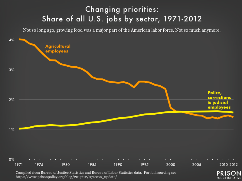 The 2.3 million incarcerated people in the United States are, of course, excluded from the labor force and therefore are not reflected in analyses of labor force participation. Including them would make the portion of the workforce that is involved in the mass incarceration system even larger.
7. Racial discrimination and use of force in “stop and frisk” policing
President Trump supports “stop and frisk” policing; but a return to the violent police tactic would be – to use some of the president’s favorite Twitter words – “a disaster!” In this visualization and report (you’ll need to click through to get the full effect) we explore the ineffectiveness of the police tactic and the racial disparities in who is stopped, who is frisked and who has force used against them by the police:
 Please click to see the full visualization in its original context.
8. Exploring the causes of jail growth
For our report Era of Mass Expansion: Why State Officials Should Fight Jail Growth we started with the big picture view of the two reasons why jail populations are growing:
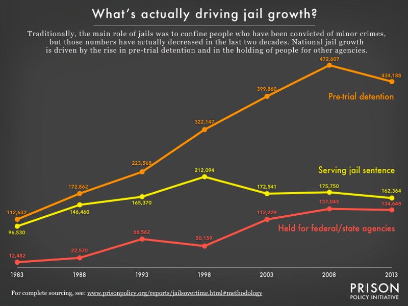 Figure 1. Most state policymakers are not tracking jails in the first place, and the jails’ frequent practice of renting cells to other agencies makes it difficult to draw conclusions from the little data that is available. This report offers a new analysis of federal data to offer a state-by-state view of how jails are being used and we find that, even more than previous research has implied, pre-trial populations are driving “traditional jail” growth. The data behind this graph is in Table 1.
9. The rise of the “prosecutor politician”
Fordham University historian Jed Shugerman has finally made it possible to examine the scale of prosecutors’ influence on American politics and justice throughout history. At great effort, he produced the data and made it available to the public. To draw more attention to it, we made a visualization to accompany our blog post about the data:
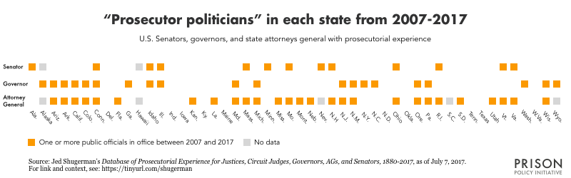 In at least 38 states, a senator, governor, and/or attorney general holding office in the past 10 years was once a prosecutor. This chart may understate the prevalence of these “prosecutor politicians,” since the source is a work in progress and has no data for some positions in five states as of July 7, 2017, and does not include changes in all offices after January 2017.


