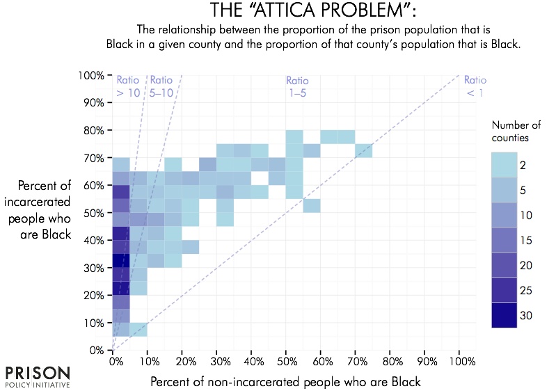
Data Source: See "data sources section of full report. (Graph: Peter Wagner, 2015)
This graph originally appeared in The Racial Geography of Mass Incarceration.
This chart shows that in many counties Black people in prison are overrepresented compared to the portion of Black people in the free population. Notably, many of these counties are concentrated in the far left of the graph; where Blacks make up 20% to 60% of the prison populations yet less than 5% of the free population.
