Collaborations with Artists
“PPI is one of the most imaginative research groups illuminating the dark recesses of our carceral landscape.”
—Pete Brook, Prison Photography
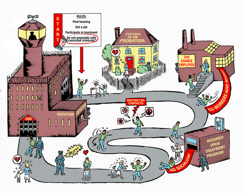
Guilty by association: When parole and probation rules disrupt support systems (2023)
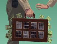
Once again, artist Kevin Pyle helped us portray several ways in which supervision restrictions on "association" can make reentry needlessly difficult.
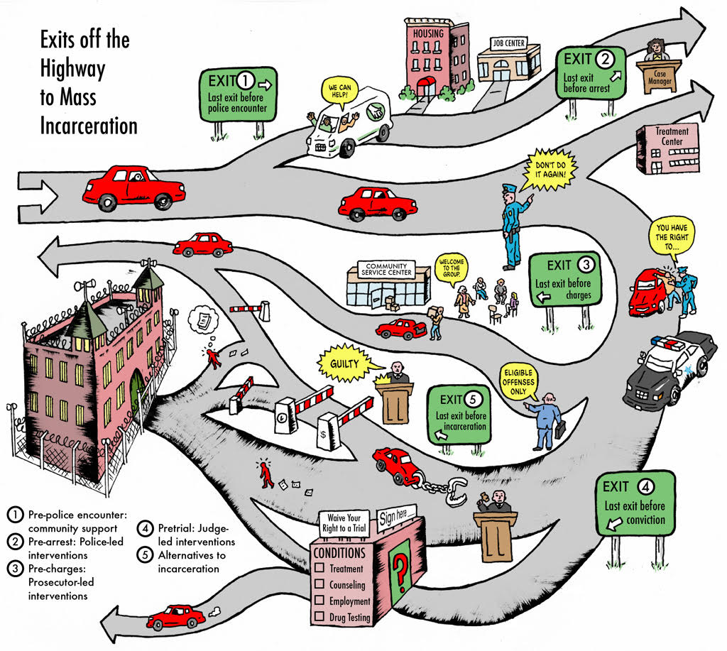
Building exits off the highway to mass incarceration (2021)
Artist Kevin Pyle returned to visualize the landscape of diversion programs and alternatives to incarceration.
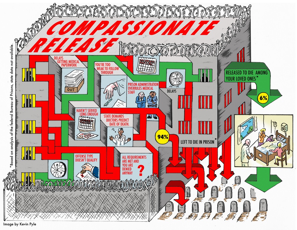
Compassionate release was never designed to release large numbers of people (2020)
We collaborated with artist Kevin Pyle to illustrate that applying for compassionate release fron prison is a lengthy and cumbersome process.
Visualizing 10.6 million jail admissions each year (2018)
We collaborated with data journalist and illustrator Mona Chalabi to visualize just how vast a number 10.6 million jail admissions is.
Video visitation is not “just like Skype” (2015)
We collaborated with NYC comedians to challenge the video visitation industry's offensive claim that video visitation is "just like Skype" with 4 short videos. The videos have been featured in Truthout, the Denver Westword, and HuffPo Live.
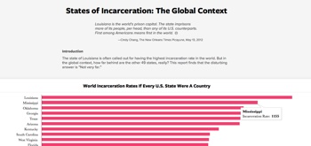
States of Incarceration: The Global Context (2014)
We worked with data artist Josh Begley to put the rate of incarceration for each state in the United States into the global context. The state of Louisiana has the highest incarceration rate in the world, but criminal justice policy in every region of this country is out of step with the rest of the world.
This project was featured in more places than we could count, including The Atlantic, Reason, VICE News, Newsmax, Carceral Geography blog, The Tampa Bay Times, The Clarion-Ledger, The Texas Observer, NOLA.com, and International Business Times. (We then updated this report in 2016, 2018, and 2021.)
Mass Incarceration in the United States (2014)
We helped Hank Green of Vlog Brothers, Kurzgesagt, and Visual.ly explain mass incarceration in under 4 very powerful minutes. This video has more than 1.3 million views, and inspired an important follow up video from Hank's brother, John Green.
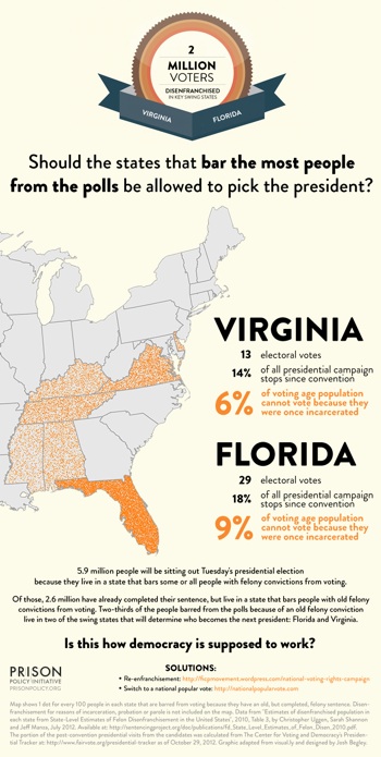
Disenfranchisement info graphic (2012)
We worked with Josh Begley to create this info graphic showing that the states that bar the most people from the polls are likely to be the same states that cast the deciding vote for president in the 2012 election. This graphic appeared in the Richmond Times-Dispatch, Mother Jones, Solitary Watch, and Prison Photography.
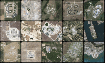
Prison Map (2012)
Josh Begley used the data in our Correctional Facility Locator to ask the question: What does the geography of incarceration in the United States look like? Be sure to read Josh’s explanation of the project and the review on the Prison Photography blog: 4,916 Prisons In One Place: ‘Prison Map’ by Josh Begley. This project was also featured outlets such as Wired magazine, Le Monde, the Carceral Geography blog, and The Atlantic's Citylab.
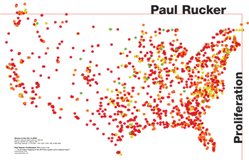
Proliferation (2009)
Paul Rucker’s installation, Proliferation, inspired by the map of U.S. Prison Proliferation, 1900-2000 by the Prison Policy Initiative’s Rose Heyer is an animated history of prison construction in the United States set to an original score. Peter Wagner was invited to write about prison-based gerrymandering for the liner notes of the DVD. This video was featured in The Washington Post, Prison Photography, artnet news, Of Note magazine, and in Paul's TEDxBerkeley talk.
Events
- April 15-17, 2025:
Sarah Staudt, our Director of Policy and Advocacy, will be attending the MacArthur Safety and Justice Challenge Network Meeting from April 15-17 in Chicago. Drop her a line if you’d like to meet up!
Not near you?
Invite us to your city, college or organization.
