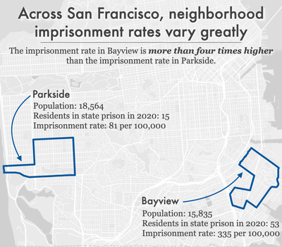
Data Source: California state redistricting data and U.S. Census Bureau P.L. 94-171 redistricting data processed by Peter Horton at Redistricting Data Hub. See report for full methodology and underlying data tables. (Graph: Emily Widra, 2022)
This graph originally appeared in Where people in prison come from: The geography of mass incarceration in California.
The underlying data can be found in the report’s appendix tables.
Events
- April 15-17, 2025:
Sarah Staudt, our Director of Policy and Advocacy, will be attending the MacArthur Safety and Justice Challenge Network Meeting from April 15-17 in Chicago. Drop her a line if you’d like to meet up!
Not near you?
Invite us to your city, college or organization.


