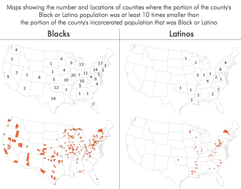
Data Source: See "data sources section of full report. (Graph: Peter Wagner, 2015)
This graph originally appeared in The Racial Geography of Mass Incarceration.
These maps shows where Blacks or Latinos are over-represented at least 10 times in the prison population compared to the surrounding county. Many of the states without any counties marked on this map are states where counties are less relevant as a unit of analysis (ie. Massachusetts and Rhode Island) or where the Black or Latino population is very small and therefore excluded from our analysis (ie. Montana). For Latinos, the over-representation is significant in most states but is less dramatic than for Blacks.


