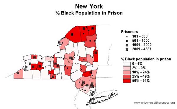
Data Source: New York Department of Correctional Services and U.S. Census, 2000. (Map: Rose Heyer, 2003)
This map originally appeared in Impact in New York.
Events
- April 30, 2025:
On Wednesday, April 30th, at noon Eastern, Communications Strategist Wanda Bertram will take part in a panel discussion with The Center for Just Journalism on the 100th day of the second Trump administration. They’ll discuss the impacts the administration has had on criminal legal policy and issues that have flown under the radar. Register here.
Not near you?
Invite us to your city, college or organization.


