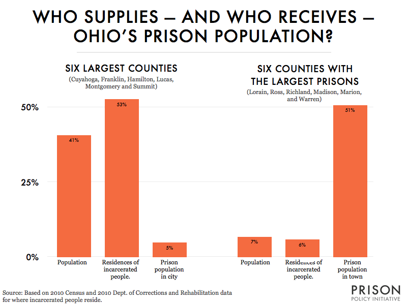
Data Source: Based on 2010 Census and 2010 Dept. of Corrections and Rehabilitation data. (Graph: Peter Wagner, 2013)
This graph originally appeared in Ohio's migration to prison, as seen through the Census.
Events
- April 15-17, 2025:
Sarah Staudt, our Director of Policy and Advocacy, will be attending the MacArthur Safety and Justice Challenge Network Meeting from April 15-17 in Chicago. Drop her a line if you’d like to meet up!
Not near you?
Invite us to your city, college or organization.
