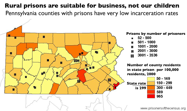
Data Source: Pennsylvania Department of Corrections and U.S. Census, 2000. (Map: Rose Heyer, 2003)
This map originally appeared in Impact in Pennsylvania.
Events
- March 14, 2025 (Pi Day):
On Friday, March 14th at 1 p.m. Eastern, Prison Policy Initiative will host an Instagram Live conversation about the brand new report, Mass Incarceration: The Whole Pie 2025. Click on this link on your mobile phone to set a reminder or attend. - March 19, 2025:
Join Prison Policy Initiative’s Advocacy Department at 1 PM EST on Wednesday, March 19, 2025, for a webinar about understanding recidivism. We will cover strategies from our recidivism toolkit, including an overview of recidivism statistics and what they really mean, how to combat the “Willie Horton” effect, and ways that advocates can transform the narrative around reentry to make it less focused on negative outcomes and more focused on the ways that returning citizens contribute to their communities. - April 15-17, 2025:
Sarah Staudt, our Director of Policy and Advocacy, will be attending the MacArthur Safety and Justice Challenge Network Meeting from April 15-17 in Chicago. Drop her a line if you’d like to meet up!
Not near you?
Invite us to your city, college or organization.


