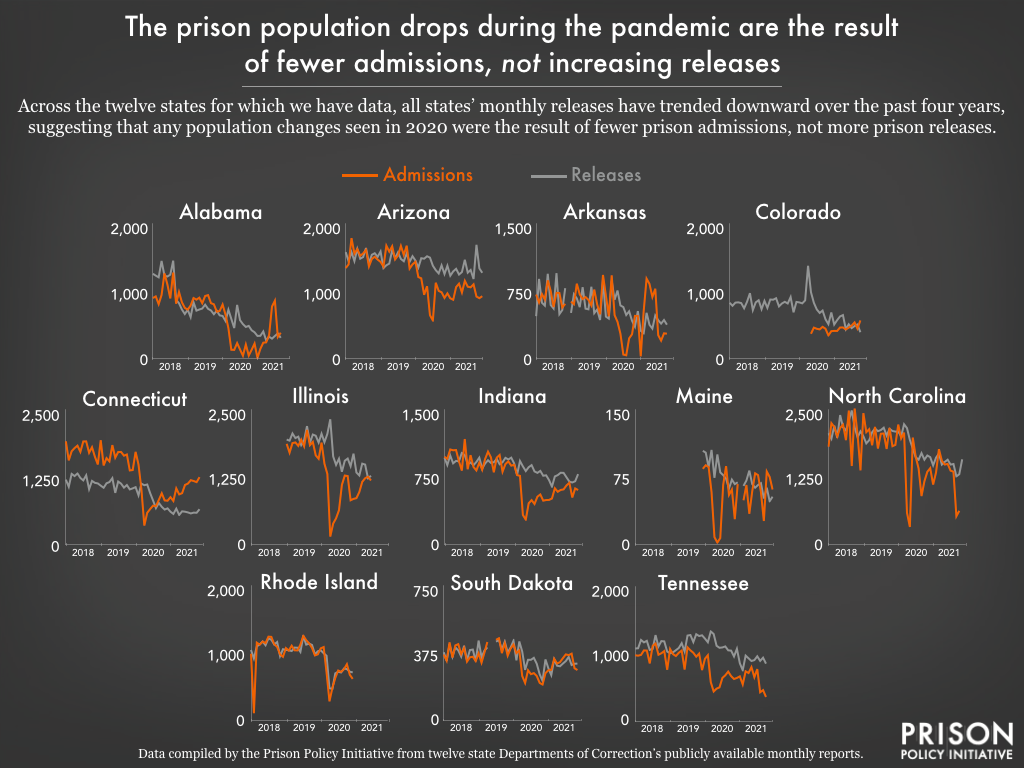
Data Source: Data compiled by the Prison Policy Initiative from ten state departments of corrections’ publicly available monthly reports. Note that the y-axis for Arkansas, North Carolina, Illinoid, & South Dakota differ from the other six states to show the monthly variation more clearly. (Graph: Emily Widra, 2022)
This graph originally appeared in State prisons and local jails appear indifferent to COVID outbreaks, refuse to depopulate dangerous facilities.
These twelve states publish monthly release and admission data for 2018, 2019, 2020, and most of 2021. These data show us a pattern of responses to the COVID-19 pandemic: reducing prison admissions, while releasing fewer people from prison.
Events
- April 15-17, 2025:
Sarah Staudt, our Director of Policy and Advocacy, will be attending the MacArthur Safety and Justice Challenge Network Meeting from April 15-17 in Chicago. Drop her a line if you’d like to meet up!
Not near you?
Invite us to your city, college or organization.
