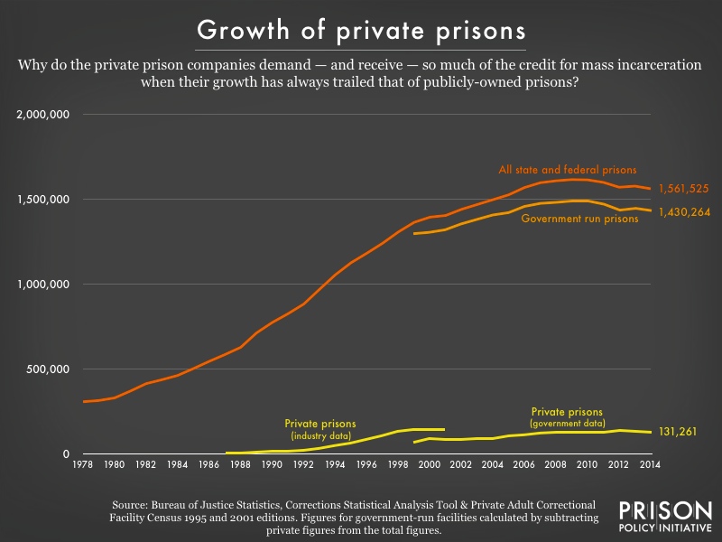
Data Source: Bureau of Justice Statistics, Corrections Statistical Analysis Tool & Private Adult Correctional Facility Census 1995 and 2001 editions. Figures for government-run facilities calculated by subtracting private figures from total figures. (Graph: Peter Wagner, 2015)
This graph originally appeared in Are private prisons driving mass incarceration?.
Note that the federal government didn’t even bother to track the size of private prisons until 1999 and that we calculated the size of the government-run prisons by subtracting the private prisons from the total. The data from 1987 to 2001 was collected and published by an academic in Florida with a uniquely close relationship with the industry. Due to different methodologies, the data aren’t entirely compatible but together they show the birth and initial growth of the industry follows rather than leads the prison boom. The industry’s long plateau in the last decade makes it clear that the private prison industry has largely been locked out of sizable growth.
