March 19, 2025: Join Prison Policy Initiative’s Advocacy Department at 1 PM EST on Wednesday, March 19, 2025, for a webinar about understanding recidivism. We will cover strategies from our recidivism toolkit, including an overview of recidivism statistics and what they really mean, how to combat the “Willie Horton” effect, and ways that advocates can transform the narrative around reentry to make it less focused on negative outcomes and more focused on the ways that returning citizens contribute to their communities.
April 15-17, 2025: Sarah Staudt, our Director of Policy and Advocacy, will be attending the MacArthur Safety and Justice Challenge Network Meeting from April 15-17 in Chicago. Drop her a line if you’d like to meet up!
Not near you? Invite us to your city, college or organization.
Here at the Prison Policy Initiative, we know that in order to keep winning victories for fairness and justice, the movement to end mass incarceration needs compelling and up-to-date information about the U.S. incarceration crisis. This year, we’ve continued to fill critical gaps in the movement’s knowledge with exciting reports that:
Show that each state’s rate of incarcerating women is far out of step with the rest of the world. Compared to other countries, most U.S. states lock up proportionally more women than any other country in the world.
Uncover the data to show that even before their incarceration, the people in prison are much poorer than Americans of similar ages, race/ethnicity and gender. This report was also the first to provide the pre-incarceration incomes of women in prison.
Reframe the entire debate about visitation and reentry with new data that demonstrates that incarcerating people far from home actively discourages family visits.
Provide critical new data to demonstrate the degree to which mass incarceration transfers people of color to predominantly white communities.
Demonstrate that jails, not just prisons, matter in policy discussions because 11 million people cycle through jails, and the dramatic growth in the jail population is the direct result of policies that increasingly detain people awaiting trial.
These reports were made possible by the generosity of a small group of individual donors. Can you make a gift today so we can both advance specific campaigns for justice and produce critical research?
To encourage you to give generously, some of our existing donors will match the first $19,000 that we receive in this appeal.
We thank you for standing by our side in the fight for fairer and safer communities for everyone.
The Voice of OC has revealed that $85,000 in campaign contributions to two Orange County, California county supervisors by Global Tel*Link flipped the two supervisors from being opponents of charging families high phone rates into supporters.
The Voice of OC articles are a must-read (first article, second article), and they have a video showing the dramatic change in positions:
We’re thrilled to see more investigation of the phone companies using campaign contributions to purchase influence. We broke the first story of this type in August, with our exposé that found that Securus was one of the largest contributors to the sheriff’s reelection campaign in Sacramento, California. Notably, this is a county where Securus did not have the contract, but clearly wanted to be the winning bidder when the contract was next put out for bid.
How big is $85,000 in campaign contributions, exactly? To be sure, it pales in comparison to the $4 million/year in kickbacks that the contract would give to the Orange County slush fund called the “Inmate Welfare Fund”. (Despite the name, the funds can be used for almost anything, and as the Voice of OC article says, most of it is spent on staff salaries.)
On the other hand, $85,000 was apparently enough to change these two votes in this one county. And it’s a massive sum when you compare it to the outrage that was aimed at Hillary Clinton after The Interceptreported that bundlers associated with the private prison industry were supporting her presidential campaign with similar amounts of money. (ColorOfChange says that the total received by the Clinton campaign from the industry was $133,000.)
It’s stories like this that illustrate two points we’ve been making a lot lately:
Jails matter. Their policies might be set by 3,000 local governments, which can make them hard to follow and understand. But we need to look at jails, which are literally mass incarceration’s front door.
Private prisons get all the attention, but other kinds of prison profiteers like the prison phone industry and the California guard union are just as successful — if not more so — at buying the outcomes they want.
Report reveals that every US state incarcerates women at higher rate than most countries, shows growth of women's incarceration in the US over the last century.
November 18, 2015
Easthampton MA — How does your state compare to the international community when it comes to incarcerating women? Not very well, says a new infographic and report from the Prison Policy Initiative.
While there are important differences in the extent and rate at which different U.S. states incarcerate women, there are also differences between how American states, and the country as a whole, compare with most other nations in their propensity to incarcerate women.
“Our analysis shows that even states which seem to incarcerate women less than others in the U.S. are in fact incredibly punitive once that isolationist worldview is broadened,” said Aleks Kajstura, Legal Director of the Prison Policy Initiative. “Every single state incarcerates women at a rate that far exceeds international norms.”
This report is the first to directly put individual U.S. states’ rates of incarcerating women in the global context. The report draws on international statistics from the London-based Institute for Criminal Policy Research, state-level data from the U.S. Census Bureau for interstate and international incarceration comparisons, and historical data from various sources for a detailed look at the U.S.’s past record on women’s incarceration.
The Prison Policy Initiative found that nearly 30% of the world’s incarcerated women are imprisoned in the U.S. even though only 5% of the world’s women live here. Overall, with the exception of Thailand and the U.S. itself, the top 44 jurisdictions throughout the world with the highest rate of incarcerating women are individual American states.
In Illinois, the incarceration rate for women is on par with El Salvador, where abortion is illegal and women are jailed for having miscarriages. New Hampshire is on the same level as Russia, and New York with Rwanda.
“The statistics revealed by this report are simple and staggering” the report concludes. “They suggest that states cannot remain complacent about how many women they incarcerate. Women should be a mainstay of any state policy discussions on the economical and effective use of incarceration if we hope to incarcerate fewer women.”
The non-profit, non-partisan Prison Policy Initiative produces cutting edge research to expose the broader harm of mass incarceration, and then sparks advocacy campaigns to create a more just society. This report was prepared by Aleks Kajstura, Legal Director of the Prison Policy Initiative, and Russ Immarigeon, an independent researcher and editor of the two-volume set, Women and Girls in the Criminal Justice System: Policy Strategies and Program Options (Civic Research Institute, 2006, 2011).
For further information, contact Aleks Kajstura at akajstura [at] prisonpolicy.org.
Last month James Kilgore published a new report evaluating the use of electronic monitoring as an alternative to incarceration. Drawing on an impressively wide range of sources, “Electronic Monitoring Is Not the Answer: Critical reflections on a flawed alternative” tackles the use of electronic monitoring in the context of mass incarceration and the expanding surveillance state.
The report recommends 14 guiding principles for re-framing the U.S.’s approach to electronic monitoring, concluding that:
In the present context, there is little evidence to support EM as a genuine alternative to incarceration. At the same time, EM is not going to go away, especially with the constantly expanding capacity of devices to track and gather other data. If decarceration gathers steam, EM will become an important option. Before that happens, the debate around its use and implications needs to sharpen. Any useful framing must open up a dialog around the rights of the monitored and link EM to state and corporate surveillance. Otherwise, we run the risk of hundreds of thousands of people being virtually incarcerated in their homes and of the net widening to track many more who have not even had an encounter with law enforcement.
A point by point summary and full report are available here.
John Oliver explains another broken aspect of the criminal justice system, re-entry. Oliver illustrates the various ways that we set formerly incarcerated people up to fail, from restrictions on housing and employment to the rolling back of Pell grants. According to Oliver, because of the resounding and bipartisan support for enacting barriers to re-entry during the tough-on-crime era, we should all feel responsible for the lack of opportunity available to people trying to turn their lives around.
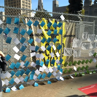
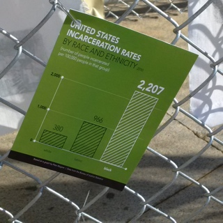
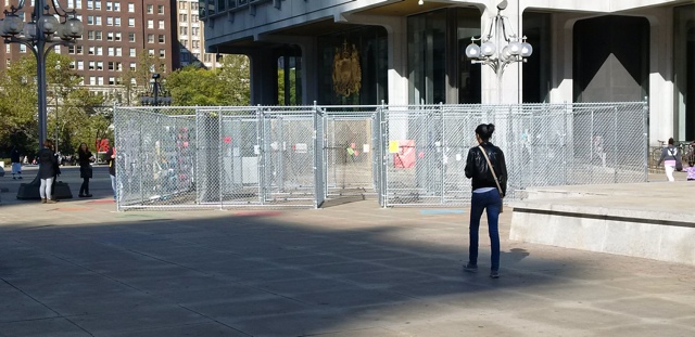
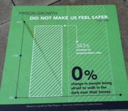
For the month of October, some of our research is hanging in a public art installation about mass incarceration just outside of Philadelphia City Hall. The central element of artist Sam Durant’s installation “Labyrinth”, designed in collaboration with men incarcerated at Graterford State prison, is a large maze made of chain-link fencing.
Within and around the maze are some facts about mass incarceration and the public is invited to leave their comments.
While we often collaborate with artists, that our research was used in this show was a pleasant surprise. We intend our work to be used in new and exciting ways to advance the movement against mass incarceration, and we are thrilled that Sam Durant found a way to do so.
For more on this exhibition, see these two great articles with more pictures of the entire exhibition:
The Federal Communications Commission today approved a new order regulating the prison and jail telephone industry and reducing the cost of calling home from prisons and jails
The Federal Communications Commission today approved a new order regulating the prison and jail telephone industry and reducing the cost of calling home from prisons and jails.
We’ll have a detailed analysis after the full text of the FCC’s order is publicly available, but for now we note only one possible change from our October 1 post: The FCC is proposing to give the industry an additional 3 months to bring their contracts in jails into compliance with the new rules. That means that people with loved ones in state prisons should see the impact in about February, and with those in jails in about May 2016.
Thank you Commissioner Clyburn, Chairman Wheeler, and Commissioner Rosenworcel for taking such strong action to protect the most vulnerable families in this country from this exploitative industry.
Are you interested in joining our dedicated team to produce cutting edge research to expose the broader harm of mass criminalization? Do you want to shape innovative advocacy campaigns and spark critical discourse to create a more just society?
If so, our new employment opportunity Policy & Communications Associate might be for you. Please spread the word, and if you think the position is for you, please apply.
Yesterday, the top judge in Massachusetts cited our research in his “State of the Judiciary” address.
Supreme Judicial Court Chief Justice Ralph D. Gants made a strong argument for sentencing reform and used our report States of Incarceration: The Global Context to argue that Massachusetts, a state with one of the lowest rates of incarceration in the nation, should and can do so much more:
If we believe that the vast majority of the 46 percent of prisoners currently being released from state prison without any post-release supervision should have post-release supervision, how are we to pay for it? One alternative is to redirect the money that would be saved by reducing the length, and therefore the rate, of incarceration. How can we do that? After all, are we not among the states with the lowest rate of incarceration? It is true that in a nation that has gone mad with mass incarceration, we have maintained some semblance of sanity; our rate of incarceration is less than one-half of the national average. But our rate of incarceration is three times what it was when I graduated from law school in 1980, even though our rate of violent crime today is roughly 22 percent lower than in 1980 and our rate of property crime is nearly 57 percent lower. According to the Prison Policy Initiative, if Massachusetts were a separate nation, our rate of incarceration would be the eighth highest in the world, exceeded only by the United States (which ranks first), Russia, Cuba, El Salvador, Thailand, Azerbaijan, and Rwanda; it is 2 1/2 times higher than the rate in the United Kingdom. There is certainly room in Massachusetts for justice reinvestment and I am confident we can find common ground with the Legislature and the Governor on ways to be smarter on sentencing so that we can reduce both the rate of incarceration and the rate of recidivism.
We were also thrilled to see the Judge draw attention to what should be a common sense reform: criminal justice fees. Chief Justice Gants said:
And if we are truly committed to reducing recidivism, should we not take a fresh look at the various fees we impose on criminal defendants that go to the state’s general fund? Indigent counsel fee: $150. Probation supervision fee: $780 for one year of supervised probation and $600 per year for administrative probation. Victim-witness fee: $90 for a felony, $50 for a misdemeanor. For an indigent defendant convicted of one felony and sentenced to one year of supervised probation, the fees total $1,020, more if a GPS bracelet is a condition of probation, because the defendant is required to pay for that, too. A judge may waive payment where the judge finds it would cause undue hardship, but judges must then require community service in lieu of payment, and the probation department must find the defendant an appropriate community service opportunity.
I know that Massachusetts is not unique in the imposition of these fees. At least 44 states impose a probation supervision fee; at least 43 impose an indigent counsel fee. I also know that the revenue yielded by these fees in Massachusetts is not insubstantial: $21 million in probation supervision fees; $7 million in indigent counsel fees; about $2.4 million in victim-witness fees, in all more than $30 million per year. But should we not stop and ask: who are we asking to pay these fees? Most are dead broke, or nearly broke. Approximately 75 percent of criminal defendants are indigent. Collection is difficult, and we are asking probation officers to take charge of this collection, and to allege a violation of probation where a defendant fails to pay. And the law requires yet another payment of a $50 fee when a default warrant is issued because of a defendant’s failure to pay.
We want probationers to succeed on probation, and we want probation officers focused like a laser beam on the elements that will help probationers succeed: finding a job, getting an education, dealing with drug addiction and mental health problems, ending the cycle of domestic violence. Should we not ask whether the financial burden of these fees is making it more difficult for probationers to succeed? Is it increasing the rate of violation? Does it make sense to transform probation officers into debt collectors and community service coordinators, to burden our courts with the obligation to collect these debts, and to use the threat of a violation of probation as a means to induce payment? Are we, in the immortal words of MBA President Bob Harnais, “spending dollars to collect nickels,” and are we collecting those nickels from a population who can least afford to pay?
On Thursday, the Federal Communications Commission is scheduled to vote on a proposal to cap the cost of all calls home from prisons and jails and to curtail or ban the abusive fees charged by the industry.
By capping the cost of calls and the fees, the FCC will have established a ceiling on what can be charged. But states and individual counties should — and many will — go even further. There are at least two types of state legislation that could be passed.
Idea 1: Simple fix that the facilities might not like but is really the best way to go.
Ban commissions and require all contracts to be negotiated on the basis of the lowest price to the consumer. New York Corrections Law § 623 is a great model, although an even better version would apply to contracts with local jails as well as state prisons.
Idea 2: Long-term market re-alignment.
Create a statutory ceiling on commission payments on a per minute basis in order to re-align incentives for facilities to effectively negotiate with the vendors for the lowest rates for consumers.
Currently, commissions are typically negotiated on a percentage basis, so facilities have an incentive to tolerate high customer costs, so changing to a fixed per-minute commission would change the incentives, to give the facilities an incentive to favor low-cost higher-volume calls home.
Let me explain.
The FCC’s order caps the maximum that can be charged at 11cents a minute in prisons and, depending on the size of the facility, 14-22 cents a minute in jails. For the sake of this illustration, let’s talk about jails in the 14 cents a minute category.
First, capping the cost at 14 cents will constitute a tremendous and long-needed rate reduction across the country. But how can a state easily ensure that rates continue to move downwards, even in facilities that will not waive their commission?
Under the status quo in the states that allow commissions, the facilities have an incentive to set the rates at the maximum and then demand that the vendors pay the maximum commission. So rates are likely to be at 14 cents forever. As the cost of providing service declines with further advances in technology, the cost might stay at 14 cents while the facilities demand 13.9999 cent commissions.
But if a state were to set a maximum commissions at, say, 3 cents a minute, it would give facilities an incentive to push the rates down in order to increase usage. With such a maximum per minute commission, the rates wouldn’t ever go below the commission level of 3 cents, but the facilities would have an incentive to push the rates down as close to that 3 cents as they can. (We don’t have a position on what the commission amount per minute should be, and we used 3 cents just to illustrate the math.)
As we’ve seen in New York and nationwide, lowering the total price to the families increases the call volumes.
This structure would also give the facilities an incentive to ensure that the vendor doesn’t charge unnecessary fees. Prior to the FCC’s October 2015 ruling, the companies charge hidden fees as a way to recoup lost profits from paying unsustainably high commissions. (The business model is called fee harvesting and shortchanges both the families and the facilities; but since the facilities are already receiving windfalls on the call rates, they often don’t object to the extra fees.)
The new FCC ruling will ban most of the fees that were previously charged by the industry and caps all fees that remain. But as fees eat into the money that families can spend on the actual calls, this proposal gives the facilities a financial incentive to insist on even lower fees as that would further increase the number of minutes used.
March 19, 2025: Join Prison Policy Initiative’s Advocacy Department at 1 PM EST on Wednesday, March 19, 2025, for a webinar about understanding recidivism. We will cover strategies from our recidivism toolkit, including an overview of recidivism statistics and what they really mean, how to combat the “Willie Horton” effect, and ways that advocates can transform the narrative around reentry to make it less focused on negative outcomes and more focused on the ways that returning citizens contribute to their communities.
April 15-17, 2025: Sarah Staudt, our Director of Policy and Advocacy, will be attending the MacArthur Safety and Justice Challenge Network Meeting from April 15-17 in Chicago. Drop her a line if you’d like to meet up!
Not near you? Invite us to your city, college or organization.

 For the month of October, some of our research is hanging in a public art installation about mass incarceration just outside of Philadelphia City Hall. The central element of artist Sam Durant’s installation “Labyrinth”, designed in collaboration with men incarcerated at Graterford State prison, is a large maze made of chain-link fencing.