United States profile
- Sections:
- Overview
- Incarceration over time
- Probation and parole
- Racial and ethnic disparities
- Ending prison gerrymandering
- Other national research and advocacy materials
With nearly two million people behind bars at any given time, the United States has the highest incarceration rate of any country in the world.
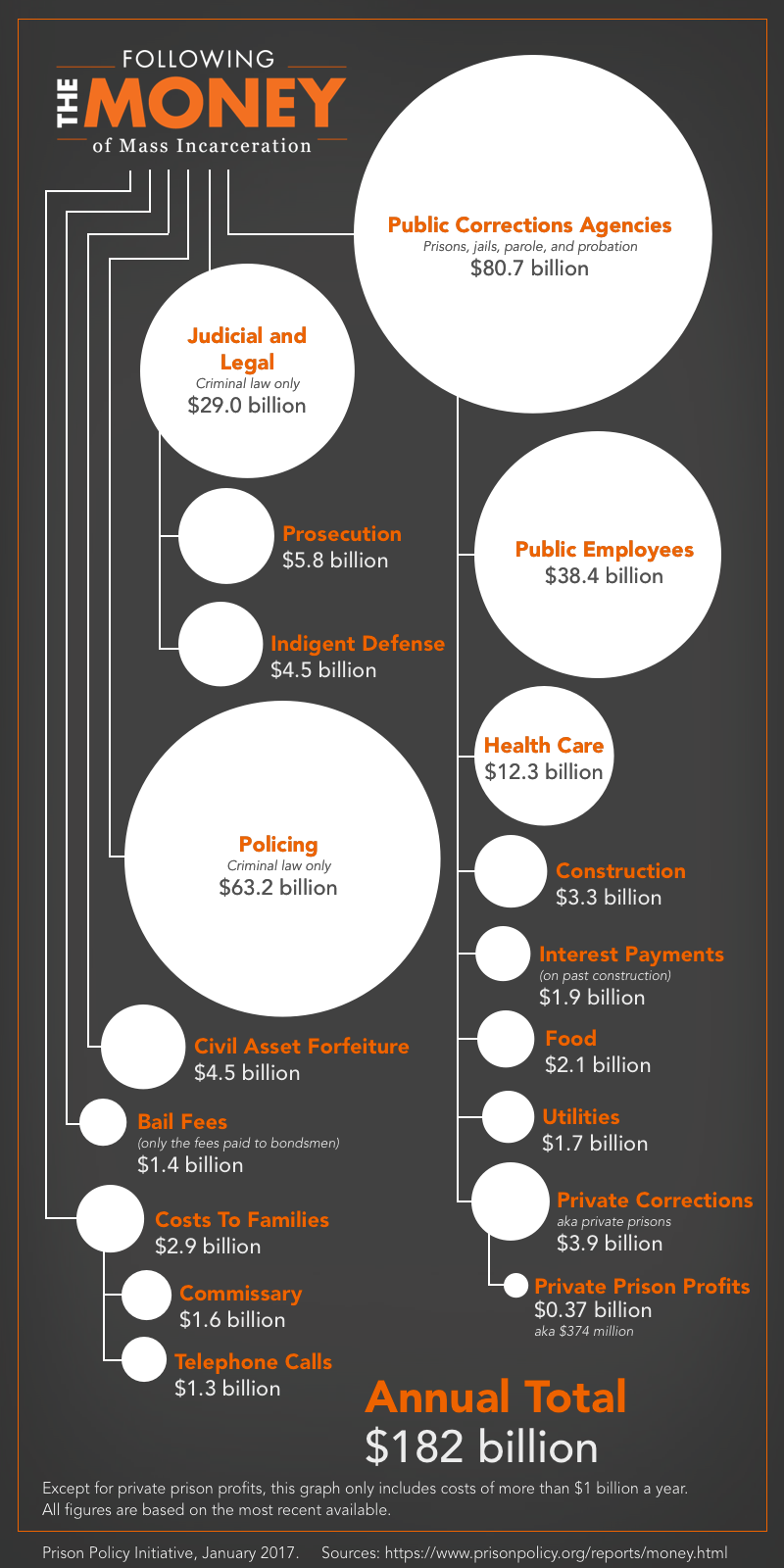
We spend about $182 billion every year — not to mention the significant social cost — to lock up nearly 1% of our adult population. To be able to evaluate this policy choice, our communities must have access to reliable and up-to-date information about the trajectory and scope of our nation’s experiment with mass incarceration. With this page, and the accompanying 50 State Incarceration Profile series, we hope bring some of the most important and under-discussed national facts into the public discourse.
Overview

Global comparisons

Probation and Parole
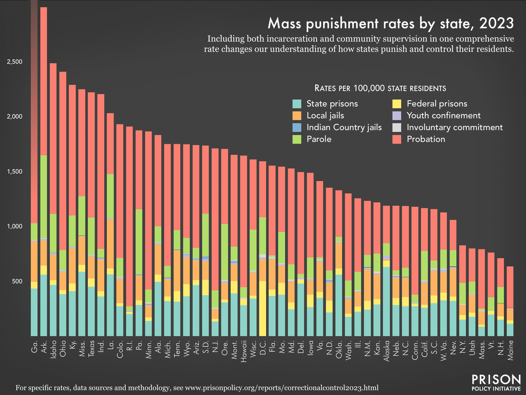 See detailed graphs and data for your state.
Incarceration over time
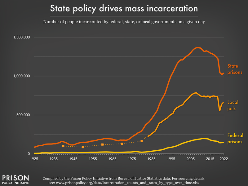
Or see individual graphs for:
- Federal prisons: rates or total numbers
- State prisons: rates or total numbers
- Local jails: rates, total numbers, and by conviction status
- Women in state prisons: rates or total numbers
- Men in state prisons: rates or total numbers
Racial and ethnic disparities
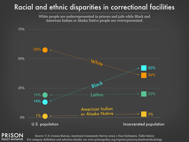
See graphs on racial disparities in correctional facilities by state, as well as incarceration rates by race and ethnicity for every state.
Ending prison gerrymandering
The way the Census Bureau counts people in prison creates significant problems for democracy and for our nation’s future. It leads to a dramatic distortion of representation at local and state levels, and creates an inaccurate picture of community populations for research and planning purposes.

- Prison Gerrymandering Project
- 50-state overview of prison gerrymandering
Other Prison Policy Initiative national research and advocacy materials
 Regulating the prison telephone industry
 50-state Incarceration Profiles
 How do the incarceration rates of the U.S. states measure up in the global context?
 Guide to legal resources for incarcerated people, organized by state
 Prison Policy Initiative Research Library
Events
- April 15-17, 2025:
Sarah Staudt, our Director of Policy and Advocacy, will be attending the MacArthur Safety and Justice Challenge Network Meeting from April 15-17 in Chicago. Drop her a line if you’d like to meet up!
Not near you?
Invite us to your city, college or organization.

 50-state Incarceration Profiles

 Prison Policy Initiative Research Library