A new report from the Correctional Association of New York reveals why some people in prison are reluctant to get the COVID-19 vaccine and a lot of it has to do with distrust in the correctional system.
Over 3,000 incarcerated and detained people in the United States have died of COVID-19 in the past two years, with over 588,000 cumulative cases behind bars. With little sign of COVID-19 quietly fading away, public health officials have been clear, consistent, and accurate that vaccinations are our strongest defense against existing and future variants of COVID-19. But despite widespread vaccine availability across the country, many people continue to be hesitant about the COVID-19 vaccination.1
While the vaccine refusal rates are not generally worse in prisons than in the general population, vaccination is even more critical in prisons. Incarcerated people can’t employotherstrategies to avoid getting COVID-19, they have higher rates of medical conditions that make them more vulnerable to severe illness and death, and if they do fall ill, they don’t have the same access to prompt, effective medical care as people outside of prison do. Behind bars, the risks of non-vaccination can be even more deadly, with a COVID-19 death rate of more than double that of the general U.S. population.2
An insightful new report from the Correctional Association of New York offers the only survey data we know of that explains why incarcerated people are hesitant to accept the COVID-19 vaccination. 3 A report focusing on New York is particularly valuable nationally because New York State was one of the least successful states (by our data4) at vaccinating incarcerated people.5 The report finds that vaccine hesitancy in prison is rooted in general distrust and suspicion of healthcare in prison, and that the solutions to overcome vaccine hesitancy behind bars are more complicated than in non-carceral settings.
Researchers have determined that the best practice for addressing vaccine hesitancy – in general and in the context of COVID-19 – is to promote transparency, equity, and trust between individuals, communities, and healthcare providers.6 In addition, we know that community engagement,7 messaging and education,8 and timely and accurate information about vaccines are critical for responses to vaccine hesitancy.
The reality is that the prison context inherently undermines almost all of the best practices for responding to vaccine hesitancy.
The erosion of trust in prison healthcare undermines vaccination efforts
The major finding of the Correctional Association report is that the primary reason people behind bars are hesitant to get the vaccine is a lack of trust in the prison medical system.
Before COVID-19, incarcerated people were suspicious and critical of prison healthcare: they reported poor quality of care, difficulty accessing medical care, and a distrust of prison medical care. Some incarcerated people in New York cited the Tuskegee syphilis experiment and the water crisis in Flint, Michigan as reasons to be suspicious of state public health initiatives, stating, “My greatest fear is to be a lab rat for the state” and “Communities of color have always been experimented on; why are state officials going to stop now?”
But the distrust is particularly poignant in the context of COVID-19 vaccinations. A slight majority of incarcerated people surveyed by the Correctional Association reported that they generally “trust vaccines” (52%). A similar number (49%) of respondents reported that they generally trust doctors and healthcare providers to make medically correct judgements, but only 9% of respondents trust doctors or healthcare providers in a prison to make medically correct judgments.
Figure 1: Responses regarding trust of healthcare providers to the Correctional Association of New York survey of incarcerated people in New York state. This graph, published by the Correctional Association in their annual report, shows that incarcerated people are much more likely to distrust prison healthcare providers than non-prison-affiliated healthcare providers.
Given that general distrust of prison medical providers, it’s unsurprising that a significant portion of survey respondents were less likely to accept the COVID-19 vaccination if offered by the New York Department of Corrections and Community Supervision’s (DOCCS) medical staff.
Figure 2: Responses regarding likelihood of accepting the COVID-19 vaccine if administered by correctional staff and correctional health care providers to the Correctional Association of New York survey of incarcerated people in New York state. This graph, published by the Correctional Association in their annual report, shows that 42.7% of respondents are less likely to accept the vaccine if it is administered by correctional staff, again emphasizing the inherent lack of trust between incarcerated individuals and the correctional healthcare system.
“What works” to overcome vaccine hesitancy hasn’t worked in prisons
Public health experts have established best practices for addressing vaccine hesitancy, but the persistence of this distrust among incarcerated people underscores how the prison setting itself undermines these practices:
Trusted communicators are crucial to expanding vaccine acceptance. Most recommendations for addressing vaccine hesitancy emphasize the need for “trusted communicators,” but with limited visitation and suspended programming and volunteers, who are the trusted communicators in prisons? The reality is that most information about the vaccines in prisons comes from prison administrators and correctional staff. In May 2021, a month after vaccines were available to people in congregate living situations (like prisons), John J. Lennon (incarcerated in New York) recommended in a New York Times op-ed that the DOCCS “tap influential prisoners to disseminate accurate vaccine information” and even suggested utilizing the preexisting inmate liaison committees established after the Attica uprising. According to the recentCorrectional Association report, the New York DOCCS instead “developed a video featuring Tyler Perry and incarcerated people attesting to the benefits of the vaccine.” The reality is that trust, transparency, and equity have long been eroded by the criminal legal and prison systems, which this video had little hope of repairing.
Community engagement is often limited in prisons, where interactions between incarcerated people are regularly restricted. During COVID-19, community engagement behind bars all but disappeared. Programming – including education courses, work-release, treatment programs, and group activities – were suspended in every state prison system (as far as we’ve been able to tell) at some point during COVID-19. Many prisons stopped programming and in-person visits entirely for the better part of the past two years. Additionally, incarcerated people have experienced unnecessary use of solitary confinement during the pandemic. Correctional institutions in the United States have long been distanced from “mainstream” society and community, and in many ways, the pandemic has only furthered that isolation. So while having community members and volunteers who aren’t part of the prison system come in to informally discuss vaccination concerns might have helped improve vaccine acceptance, incarcerated people saw even fewer people from the outside during the pandemic.
Disseminating timely and accurate information has proven difficult in correctional facilities. Contact with those outside prison walls has been limited throughout the pandemic, with suspended or limited visitation, increasing restrictionson mail, expensivephone calls, and interrupted programming. But relying on information from only within the prison comes with a high cost for vaccine acceptance: misinformation and distrust of the vaccine can run rampant and unchecked. John J. Lennon reported for the New York Times that corrections officers where he is incarcerated told him that the vaccine was “not tested enough” and that COVID-19 was just “the flu.” A sergeant in the Florida Department of Corrections told The Marshall Project, “If I’m wearing a mask, gloves, washing my hands and being careful — I’d still feel better working like that than putting the vaccine in my body.” Other correctional officials in Florida told The Marshall Project that some of their colleagues believe the vaccine could give them the virus or that the vaccine contains some kind of tracking device.9
The responses to the Correctional Association survey point to a lack of trust in prison medical care providers based on the quality and inaccessibility of care, limited access to information about their healthcare, and the tension between healthcare professionals meeting their duty to their patients while enforcing and complying with directives of the prison administration (sometimes referred to as “dual loyalty“). The DOCCS’ mishandling of the COVID-19 pandemic and subsequent traumatic experiences during COVID-19 in prison, only served to erode incarcerated people’s trust further.
In many ways, the pandemic has served to highlight just how opaque the prison healthcare system is and just how wary incarcerated people are of prison medical care. Moving forward, prison systems must do better, not only by providing better, more accessible, more transparent health care, but also by recognizing their inherent limits when it comes to responding to public health concerns, and adopting better strategies.
Specifically, when faced with the current and future health emergencies, prison systems should:
Release more people from prisons. Nationwide, states and the federal government actually released 10% fewer people from prison in 2020 than in 2019, despite the consensus among public health officials and advocates that decarceration is crucial to protecting public health and limiting the spread of COVID-19. To reverse this trend, departments of corrections, state governments, and courts need to work together to release people from prison using any tools they have at their disposal, including large-scale releases like we saw in New Jersey, California, and North Carolina. The Correctional Association report recommends increasing the use of pretrial release, alternative sentencing, early release, medical parole, parole board release, and commutation to rapidly reduce prison populations.
Address issues of transparency and equity in correctional health care. To address these issues in the context of COVID-19, the Correctional Association report recommends expanding the provision of adequate and timely information about COVID-19 and the vaccine, and alleviating gaps in the quality of medical services by expanding preventative care (routine screenings, education, and outreach). To improve general correctional healthcare, the Correctional Association report recommends that the state designate an independent correctional ombuds to investigate and resolve complaints related to incarcerated peoples’ health, safety, welfare, and rights, as well shift oversight of correctional healthcare to the state department of health.
Ensure that corrections officials are dedicated to reducing our reliance on incarceration and improving the health and welfare of those under their care. Corrections officials and decision makers need to take COVID-19 – and the subsequent deaths of over 3,000 incarcerated people – seriously. Incarcerated people’s connection to up-to-date news is tenuous at best, and during COVID-19 (with limited visits and changes in phone call and mail policies), they’ve been even more reliant on information directly from corrections departments. Mixed messages about the realities of COVID-19 from corrections departments (we’ve heard at least one report of a PA system announcement in a Pennsylvania prison facility stating that the pandemic is “over”) and corrections officers’ own vaccine hesitancy and misinformation leave incarcerated people in the dark to the detriment of everyone.
While COVID-19 vaccinations and booster doses are some of our strongest defenses in the face of the continued pandemic and new variants, it’s increasingly clear that prison systems need to prioritize decarceration. No amount of public health education and vaccine messaging will, on their own, dismantle decades of distrust and suspicion of prison health care. Prisons are no place for a public health crisis and government officials should be prioritizing releases and decarceration as both a first response and an ongoing response to emergencies like COVID-19.
Footnotes
The World Health Organization (WHO) defines “vaccine hesitancy” as a “delay in acceptance or refusal of vaccines despite availability of vaccine service” and in 2019 – before COVID-19 – vaccine hesitancy was one of the ten greatest risks to global health. ↩
The COVID-19 death rate in prisons at the end of April 2021 stood at a staggering 200 deaths per 100,000 incarcerated people, much higher than the death rate among the general U.S. population of 81 deaths per 100,000 residents. These rates, calculated by the UCLA Law COVID Behind Bars Data Project, were adjusted to account for differences in age and sex between the prison population and the general U.S. population. For more details about how these rates were calculated, see “COVID-19 Incidence and Mortality in Federal and State Prisons Compared With the US Population, April 5, 2020, to April 3, 2021” published in the Journal of the American Medical Association. ↩
Although it is outside the scope of the Correctional Association report and this briefing, it is important to mention that there are still instances of incarcerated and detained people requesting COVID-19 vaccines and/or boosters and being denied. For example, a 2022 lawsuit filed by the ACLU on behalf of people detained in ICE facilities reported that detainees had been repeatedly denied booster doses despite obvious medical vulnerabilities. ↩
Comparative data on vaccination in prisons is very hard to come by as many states do not publish the data, do not publish it frequently, or calculate it differently. But as of our December 2021 survey, New York had one of the lowest rates – 52% as of December 5, 2021 – and almost all of the states with lower rates of vaccination had much older data, dating as far back as June 2021 when the vaccine itself was in short supply. (The Correctional Association reports a figure of 48.3% as of September 2021, which they presumably received directly from the state prison system.) ↩
New York’s vaccination plan implied that incarcerated people would be eligible early, with “those living in other congregate settings.” However, as of early March 2021, vaccine eligibility had not yet been expanded to all incarcerated people. Availability to people younger than 65 in prison was made possible by a late March 2021 New York State Supreme Court ruling, after which the New York Department of Corrections and Community Supervision began the vaccine rollout to the entire incarcerated adult population. The ruling noted that incarcerated people had been arbitrarily and unfairly excluded from the vaccine rollout plan: state officials “irrationally distinguished between incarcerated people and people living in every other type of adult congregate facility, at great risk to incarcerated people’s lives during this pandemic.” ↩
In the toolkit, we share tips and lessons we’ve learned over two decades of using data, visuals, and narratives to expose the harms of mass incarceration.
Our new advocacy department created this toolkit as part of our expanded effort to support the people and groups on the ground doing the hard work to end mass incarceration.
While most advocacy departments organize campaigns, mobilize volunteers, and pressure decision-makers for change, ours is a bit different. We’re not looking to replicate the amazing work that thousands of people and hundreds of organizations are already doing to reform the criminal legal system. Instead, as a research organization known for using data visualizations and easy-to-understand narratives, our advocacy work aims to help these organizations leverage our expertise to strengthen their campaigns. That’s why our advocacy department will focus on:
connecting state and local movement partners and decision-makers to data that can fuel their campaigns for criminal justice reform;
identifying and filling gaps where new research would support reform efforts;
producing training materials, like the Advocacy Toolkit, for use by criminal justice reform advocates; and
providing technical assistance, including identifying reform opportunities (such as our annual list of winnable state criminal justice reforms), giving messaging support, offering expert review of documents and legislation, and connecting partners working in similar spaces.
We hope these new resources will help to strengthen the movement to end mass incarceration. If you use the Toolkit in your work, tell us about it. Let us know what worked, what didn’t, and what other resources we can provide. And, if you’re an organization seeking assistance from our new advocacy department, drop us a line to let us know how we can help.
While some prison systems and local jails have maintained historically low populations, others have returned to pre-pandemic levels, despite the ongoing dangers of COVID-19 and new, more transmissible variants.
The COVID-19 pandemic is far from over, particularly inside prisons and jails. The death rate from COVID-19 in prisons is more than double that of the general U.S. population.1 As cases and hospitalizations climb outside prison walls, there is no doubt that cases are spiking in jails and prisons across the country. In state and federal prisons, over 2,900 people have died of COVID-19, almost 476,000 people have been infected, and thousands of additional cases are linked to individual county jails. Even now, when more than 75% of people in the U.S. have received at least one dose of the vaccine, correctional staff are hesitanttogetvaccinated or receive boosters, and prison systems are slow to roll out boosters to incarcerated people.2 As the more contagious Omicron variant ravages parts of the nation and renders hospitals completely overrun, nearly three quarters of prisons3 are experiencing COVID-19 outbreaks; public health officialscontinueto recommend reducing prison populations as a primary method of risk reduction. In fact, in October 2021, the American Public Health Association4 adopted a policy in support of decarceration as a public health matter and new research shows the detrimental effect of COVID-19 on all-cause mortality in state prisons. Despite the clear need for smaller confined populations, the data show that with just a few exceptions, state and local authorities are allowing their prison and jail populations to return to dangerous, pre-pandemic levels.
The federal Bureau of Prisons, state governments and departments of corrections, and local justice system officials have a responsibility to protect the health and lives of those who are incarcerated. After almost two years of outbreak after outbreak in prisons and jails, correctional authorities must be held accountable for their repeated failure to reduce populations enough to prevent the illness and death of those who are incarcerated and in surroundingcommunities.
Prisons
Even in states where prison populations have dropped, there are still too many people behind bars to accommodate social distancing, effective isolation and quarantine, and the increased health care needs of incarcerated people. For example, although California has reduced the state prison population by about 18% since the start of the pandemic, it has not been enough to prevent large COVID-19 outbreaks in the state’s prisons, and the prison system has witnessed a 300% increase in infections among incarcerated people over the past few weeks and a 212% increase in cases among staff. In fact, as of December 15th, 2021, California’s prisons were still holding more people than they were designed for, at 113% of their design capacity (and up from 103% in January 2021). Considering the continued overcrowding in the California prison system, it’s not surprising that the state is responsible for eight out of the ten largest COVID-19 prison clusters.
Figure 1. Prison population data for 50 state prison systems as reported directly from the state Departments of Correction and the Marshall Project and federal data as published weekly by the federal Bureau of Prisons. For the available population data for these 50 states and the Bureau of Prisons, see Appendix A.
Many states’ prison populations are the lowest they’ve been in decades, but this is not because more people are being released from prisons; in fact, fewer people are. Data from 2020, recently released by the Bureau of Justice Statistics, shows that prisons nationwide released 10% fewer people in 2020 than in 2019. Instead, data suggest most of the population drops we’ve seen over the past 20 months are due to reduced prison admissions, not increasing releases. In the states for which we have recent data, both admissions and releases have decreased in recent years, making clear that prisons are not using all available tools at their disposal to stop the spread of the virus in their facilities. The significant drop in admissions to prisons was largely an unintended consequence of court delays and suspension of transfers from local jails early in the pandemic, rather than any dedicated decarceration efforts. Finding ways to continue reducing the number of people admitted to correctional facilities is critical to lowering the number of people behind bars, but to quickly decarcerate, states should release far more people, too.
Figure 2. These twelve states publish monthly release and admission data for 2018, 2019, 2020, and most of 2021. These data show us a pattern of responses to the COVID-19 pandemic: reducing prison admissions, while releasing fewer people from prison.
Thankfully, some states have recognized the inefficiency of case-by-case releases and the necessity of larger-scale releases. For example, in New Jersey, Governor Phil Murphy signed bill S2519 in October 2020, which allowed for the early release of people with less than a year left on their sentences. A few weeks after the bill was signed, more than 2,000 people were released from New Jersey state prisons on November 4th, 2020.5 In February 2021, North Carolina Governor Roy Cooper announced a legal settlement had been reached to release 3,500 people in state custody (with 1,500 of those releases to take place within 90 days). The releases were the result of a NAACP lawsuit challenging prison conditions in North Carolina during COVID-19. The state said it would release people using discretionary sentence credits (similar to “good time credits”), home confinement, and post-release supervision. But these instances of larger-scale release efforts taking place in state prison systems are the exception, not the rule.
Jails
Jail populations, like prison populations, are lower now than they were pre-pandemic. Initially, many local officials — including sheriffs, prosecutors, and judges — responded quickly to COVID-19 and reduced their jail populations. In a national sample of 415 county jails of varying sizes, almost all (98%) decreased their populations from March to May of 2020, resulting in an average change of a 33% population decrease across all 415 jails at the start of COVID-19. These population reductions came as the result of various policy changes, including police issuing citations in lieu of arrests, prosecutors declining to charge people for “low-level offenses,” courts reducing cash bail amounts, and jail administrators releasing people detained pretrial or those serving short sentences for “nonviolent” offenses.
But those early-pandemic, common-sense policy changes didn’t last long. Between May 2020 and February 2021, the populations of 83% of the jails in our sample increased, reversing course from the earlier months of the pandemic. As of December 2021, 28% of the jails in our sample have higher populations now than they did in March 2020.6 Overall, the average population change across these 415 jails from March 2020 to December 2021 has diminished to only a 10% decrease, while the average population change from July 2021 to December 2021 has dropped to 0%, suggesting that the early reforms instituted to mitigate COVID-19 have largely been abandoned.
For example, by mid-April 2020, the Philadelphia city jail population reportedly dropped by more than 17% after city police suspended low-level arrests and judges released “certain nonviolent detainees” jailed for “low-level charges.” But just two weeks later — as the pandemic raged on — the Philadelphia police force announced that they would resume arrests for property crimes, effectively reversing the earlier reduction efforts. Similarly, on July 10th, 2020, the sheriff of Jefferson County (Birmingham), Alabama, announced that the jail would limit admissions to only “violent felons that cannot make bond.” That effort was quickly abandoned when the jail resumed normal admission operations just one week later. The increasing jail populations across the country suggest that after the first wave of responses to COVID-19, many local officials have allowed jail admissions to return to business as usual.
Figure 3. Jails across the country initially responded to COVID-19 by reducing the number of people detained, but that trend reversed direction in May 2020, only two months after the World Health Organization declared COVID-19 a global pandemic. Since May 2020, the data show a trend of jail populations slowly increasing. This graph contains aggregated data collected and provided by NYU’s Public Safety Lab and updates a graph in our October 2021 analysis. It includes all jails where the Lab was able to report data on March 10th and for at least 75% of the days in our research period, which ended December 31, 2021. (Data are not available for all facilities for all days, and the Lab interpolated missing data to fill those gaps.) This graph presents the data as 7-day rolling averages, which smooths out most of the variations caused by individual facilities not reporting population data on particular days. To see county level data for all 415 jails included in this analysis, see Appendix B.
In New York City, the jail population sharply declined after the pandemic was declared. Importantly, NYC jails – particularly Rikers Island – were some of the first jails in the country to witness a COVID-19 outbreak. And yet, across different demographics, NYC jail populations have slowly leveled out, suggesting that the policies responsible for the necessary decarceration are no longer in practice. In addition to suffering the effects of COVID-19, Rikers Island is also facing an unprecedented crisis following a history of over-incarceration and, according to a federal monitor, “decades of mismanagement.” At a time when jail populations should be at an all-time low, Rikers Island’s confined population surpassed the pre-COVID-19 population in July 2021. The population only dropped back down below the pre-pandemic level at the end of September 2021, when Gov. Hochul signed the Less is More Act, which reduced the number jailed for technical violations of supervision.
Figure 4. Graph showing the daily count of the NYC jail population by 5 key metrics. By all metrics, the NYC jail population dropped quickly at the start of the pandemic, but then started to rise again. On July 29, 2021 the total NYC jail population was higher than before the pandemic. Critically, the number of people detained pretrial has actually grown — from 4,284 on January 1, 2020 to 4,881 people on December 31, 2021 (with a peak of 5,768 in early July 2021) — likely because of the rollback of significant bail reform efforts last year. The population drops in September 2021 are encouraging but are largely the consequence of Governor Hochul signing the Less is More Act, releasing people on technical violations from jail, and therefore represent a helpful policy change that will reduce the population. However, the steep slope of the decline in September 2021 is unlikely to continue at that rate on its own without additional policy changes. Even with these reforms, the October 1st NYC jail population was only 7% below its pre-pandemic levels.
(Dotted lines connect periods with missing data, so the start of each dotted line and their bends represent specific historical data points.)
Even before COVID-19, prisons and jails were a threat to public health and considered notoriously dangerous places during any sort of viral outbreak. As the U.S. Supreme Court recognized years before the pandemic, by taking away a person’s ability to care for their own medical needs, carceral facilities must make sure that those who are incarcerated receive proper medical care–failure to do so can constitute a violation of of the Eighth Amendment’s guarantee against cruel and unusual punishment and necessitate a reduction in the carceral population. And yet, correctional facilities continue to be the source of a large number of infections in the U.S. The COVID-19 death rate in prisons is almost three times higher than among the general U.S. population, even when adjusted for age and sex (as the prison population is disproportionately young and male). Since the early days of the pandemic, public health professionals, corrections officials, and criminal justice reform advocates have agreed that decarceration is necessary to protect incarcerated people and the community at large from COVID-19. Decarceration efforts must include releasing more people from prisons and jails. Despite this knowledge, state, federal, and local authorities have failed to release people from prisons and jails on a scale sufficient to protect incarcerated people’s lives – and by extension, the lives of everyone in the communities where incarcerated people eventually return, and where correctional staff live and work.
Footnotes
The COVID-19 death rate in prisons at the end of April 2021 stood at a staggering 200 deaths per 100,000 incarcerated people, much higher than the death rate among the general U.S. population of 81 deaths per 100,000 residents. These rates, calculated by the UCLA COVID-19 Behind Bars Data Project, were adjusted to account for differences in age and sex between the prison population and the general U.S. population. For more details about how these rates were calculated, see “COVID-19 Incidence and Mortality in Federal and State Prisons Compared With the US Population, April 5, 2020, to April 3, 2021” published in the Journal of the American Medical Association. ↩
Among correctional staff exempt from vaccination mandates, adherence to other protective measures is also inadequate. In California, the twice-weekly testing requirement applies to about 10,000 unvaccinated correctional staff, but “nearly a third of [those employees] weren’t complying [with testing] from mid-October through mid-November, according to the most recent data provided by corrections officials.” ↩
A recent report from the UCLA COVID-19 Behind Bars Data Project reveals that among the 984 prisons publishing COVID-19 data, 72% reported a COVID-19 outbreak in January 2022. ↩
The American Public Health Association (APHA) stance includes recommendations for “moving toward the abolition of carceral systems and building in their stead just and equitable structures that advance the public’s health by (1) urgently reducing the incarcerated population; (2) divesting from carceral systems and investing in the societal determinants of health (e.g., housing, employment); (3) committing to noncarceral measures for accountability, safety, and well-being; (4) restoring voting rights to formerly and currently incarcerated people; and (5) funding research to evaluate policy determinants of exposure to the carceral system and proposed alternatives.” ↩
Unfortunately, this major victory for public health was immediately undercut by the federal Immigration and Custom Enforcement (ICE) agency which quickly arrested 88 people who were released under bill S2519. A spokesperson from ICE claimed that these 88 individuals were “violent offenders or have convictions for serious crimes such as homicide, aggravated assault, drug trafficking and child sexual exploitation.” However, these claims are brought into question when considering that the releases that took place under bill S2519 specifically excluded “people serving time for murder or sexual assault” and those serving time for sexual offenses. Although we did not include ICE facilities in our analysis, there is evidence that ICE detention facilities have a COVID-19 case rate that is up to 13 times higher than that of the general U.S. population. ↩
118 jails (28% of our sample) have higher populations now than they had before COVID-19. Some of those jails include large county jails with more than 500 people, including Wayne County, Mich., Lubbock and Galveston Counties, Tex., St. Lucie County, Fla., Prince George’s County, Md., and Bergen County, N.J. ↩
Appendix A: State and federal prison populations during COVID‑19
Prison populations for the federal Bureau of Prisons and all 50 state prison systems from January 2020 through December 2021. When available, we used prison populations as reported by Departments of Correction to The Marshall Project. If that data point was not available, we then used either the monthly average daily population (ADP) or point-in-time population counts. For the federal system, we used the first weekly population each week as reported by the Bureau of Prisons.
Appendix B: County jail populations during COVID-19
This table shows the jail populations for 415 county jails where data was available where data was available for March 10th, 2020 (the day before the pandemic was declared) and for 75% of the days between March 10th, 2020 and December, 2021. (This table is a subset of the population data available for over 1,000 local jails from the NYU Public Safety Lab Jail Data Initiative.)
*For jails without a population reported on the days we selected, we included the reported population from the closest available date.
State
County
Jail population on 3/10/2020
Jail population on 5/1/2020
Jail population on 8/22/2020
Jail popualtion on 2/3/2021
Jail population on 7/18/2021
Jail population on 12/31/2021
Percent change in jail population from 3/10/20 to 5/1/20
Percent change in jail population from 5/1/20 to 12/31/21
Percent change in jail population from 3/10/20 to 12/31/21
Newly released data doubles down on what we’ve reported before: Formerly incarcerated people face huge obstacles to finding stable employment, leading to detrimental society-wide effects. Considering the current labor market, there may be plenty of jobs available, but they don’t guarantee stability or economic mobility for this vulnerable population.
How many formerly incarcerated people are jobless at the moment? A good guess would be 60%, to generalize from a new report released by the Bureau of Justice Statistics (BJS). The report shows that of more than 50,000 people released from federal prisons in 2010, a staggering 33% found no employment at all over four years post-release, and at any given time, no more than 40% of the cohort was employed. People who did find jobs struggled, too: Formerly incarcerated people in the sample had an average of 3.4 jobs throughout the four-year study period, suggesting that they were landing jobs that didn’t offer security or upward mobility.
As the data show, not only is reentry difficult in the first months of release from prison, but the struggle to find a job actually grew over time for the study cohort of people leaving federal prison in 2010. We show these increasing jobless rates next to one of the most dire economic moments of recent years — when the US unemployment rate reached its highest point of around 15% in mid-2020.1
We warn readers that we can’t call the 60% jobless rate an “unemployment rate” — joblessness is different from unemployment, which refers to people actively looking for work. We calculated the first and only national unemployment rate for formerly incarcerated people in our 2018 report Out of Prison and Out of Work, and we can’t update that analysis, because we based it on data that the government only collected once.2 Nevertheless, the new BJS data suggest that employment rates among people who have been to prison aren’t improving.
Formerly incarcerated individuals tend to experience joblessness and poverty that started long before they were ever locked up. When they’re released from prison, the pressure is on to get a job: People on parole (or “supervised release”) often must maintain employment or face reincarceration,3 while struggling to access social services, and trying to make ends meet in a job market more hostile to them than ever before. This combination of pressures amounts to a perpetual punishment. And it’s not just formerly incarcerated individuals who are punished: Policies that weaken their ability to turn down jobs with low wages may depress wages for other workers in their industries, as we’ll explain in this briefing.
High jobless rates precede incarceration, too
A glimpse inside pre-incarceration employment.
According to the Bureau of Justice Statistics report, employment rates among the study’s cohort declined in the three years leading up to their admissions to federal prison. So while the overall US unemployment rate around this time peaked at 10% in 2009 (and was only outpaced recently in 2020), 60% or more of formerly incarcerated people found themselves jobless before their incarceration, with variation by sex, race and ethnicity.4 What explains such pervasive pre-incarceration joblessness?
Some of this decline in employment before incarceration could be explained by people being held in jail before they’re sentenced — the report does not say how many fall into this category. Still, these findings hint at two other, equally troubling connections between employment status and incarceration, though the new data don’t speak to them specifically: For one, loss of employment might be what is leading some to turn to criminal behavior, a reality that could be addressed through policy interventions. Further, there are unfortunate ramifications for people who were held in jail pretrial but not ultimately convicted or sentenced — they, too, may have lost their jobs. (And as we’ve stressed before, even a short stay in jail can be disruptive and even dangerous.)
As the new data show, one way or another, formerly incarcerated people have been routinely shut out of the workforce and denied access to opportunity. Criminal legal system involvement only makes their chances of finding a job worse, and these economic losses compound over time, making communities hit hardest by mass incarceration even worse off.
Harsh parole conditions, a lack of social welfare programs, and a tough job market are forcing formerly incarcerated people — already a low-income, majority-minority demographic — into the least desirable jobs. But not everybody is losing: Businesses have found a way to capitalize on the desperation of applicants with conviction histories and exploit the fact that these these individuals have less bargaining power to demand changes in conditions of employment, such as better wages benefits and protections. This results in lower overall wages and more harmful working conditions in certain industries.
Post-release, months of searching and moving between jobs is common
The overall employment rate over four years after the study population was released hovered between 34.9% and 37.9% — in other words, about two-thirds of the population were jobless at any given time.
For those who did find employment after release, their earnings were lower than the general population: In the first few months, formerly incarcerated people were earning just 53% of the median US worker’s wage. And after four years of seeking and obtaining irregular employment, the study population was making less than 84 cents for every dollar of the US median wage (which, in 2014, was about $28,851 annually).
Earnings were lowest for Black and Native American people released from federal prison;5 in fact, racial and ethnic disparities in earnings seemed to grow over time. These findings probably reflect an unfortunate “racialized re-entry” process for people leaving prison, where the stigma of incarceration itself and differences in social networks for job-seekers vary across racial and ethnic groups. Researchers of this concept noted that white people getting out of prison actually appeared more disadvantaged and less employable “on paper” due to higher rates of substance use and longer sentences, but still ended up with better employment and income than Black and Hispanic people leaving prison.
Employment may be one of the most important benchmarks of reentry, yet it took formerly incarcerated people an average of over six months to find their first job after release. As such, many did not maintain employment over the entire four-year study period, and the average person in the study had 3.4 jobs over that time. If that sounds erratic, it is: The average person is employed for 78% of the weeks between ages 18 and 54, while people in the study’s cohort were employed just 58% of the time post-release. When people are moving from job to job, families and the economy suffer, and people risk violating their post-release supervision and being returned to incarceration.
Lastly, though it’s not clear exactly why, people who served less than a year in federal prison actually had a harder time finding and maintaining employment post-release, and spent more time without a job than the other groups.6 Given this devastating impact on their long-term employment prospects, it’s evident that people who are given short sentences — and who pose no safety risk — should not be incarcerated to begin with.7
The struggle to find a good job
The fact that most people released from prison have spotty, sporadic employment may mean that the jobs they’re getting are difficult jobs to keep, even for an extremely motivated worker. These could be temporary jobs, jobs where workers aren’t protected from wrongful termination, or dangerous or low-wage jobs that are unsustainable.
According to the BJS report, the major industries employing formerly incarcerated people include waste management services, construction, and food service. A 2021 study released by the U.S. Census Bureau affirms this finding. The study analyzed thousands of people with felony convictions, tracking their employment and income in the years around the Great Recession (2006-2018), and found that rebounds in construction and various service industries after the recession were associated with a bump in employment and income levels for these individuals. However, the people in that study saw their employment levels plateau after a few years, even in areas where construction and manufacturing thrived.
It’s true that industries like manufacturing and construction tend to boost employment andreduce recidivism for those leaving prison. But while these jobs did, at one time, allow people to build wealth and support a family, they don’t as much anymore, meaning that they are likely not alleviating poverty among formerly incarcerated people. The fact that formerly incarcerated people are not obtaining steady, reliable work is likely related to the industries in which they’re most commonly employed.
When the workforce is under mass supervision, key industries lose employee bargaining power
Looking more closely at the “low-skill” jobs that formerly incarcerated people tend to get can help us understand how mass incarceration and supervision may be hurting whole sectors of workers. In construction and manufacturing, union membership has declined significantly over the last twenty years.8 During the same period — between2000 and2019 — the number of people on parole grew by more than 150,000, and the number of people with felony convictions swelled from 13.2 million to an estimated 24 million.
While it’s impossible to draw a causal relationship between these two trends — given the numerous factors at play — there is serious potential for exploitation of formerly incarcerated people. For example, The New York Times has reported that New Yorkers with conviction histories are shuttled into non-union construction jobs with low to no benefits. Formerly incarcerated employees placed at such companies have described being “taken aback” at the low wages, and many have had to work other jobs to supplement their pay from their day jobs in construction.
A rising number of people with felony convictions — which is the result of, among other things, overly punitive sentencing — may be depressing wages and hurting working conditions for all workers in certain industries. Formerly incarcerated workers are not to blame, especially as many have likely been working in these industries for the better part of their adult lives. Prison does nothing to improve their qualifications as workers; meanwhile, the struggle of reentry makes them more desperate for job offers, as the new data make abundantly clear.
Formerly incarcerated people need greater opportunity from today’s labor market
The new BJS data confirm that formerly incarcerated people still suffer from sky-high jobless rates (despite evidence that virtually all want to work), and that those who do find work are getting unstable jobs. Formerly incarcerated people are typically poor before they go to prison, and joblessness during reentry can push them into even deeper poverty and have a permanent impact on their wealth accumulation.
These devastating statistics have implications for workers without criminal records as well. When industries can use vulnerable workers to replace or supplement workers who demand decent wages and benefits, the price of labor declines. When burdensome supervision requirements, unnecessary occupational licensing restrictions, and a lack of social welfare programs combine to make formerly incarcerated people desperate for work, all workers suffer.
Indeed, during the labor shortages we’ve seen in 2021 and 2022, employers are turning to currentlyorformerly incarcerated people as a convenient solution. (And sadly, a rising awareness of formerly incarcerated people’s unjust barriers to employment has allowed some of these employers to frame their actions as enlightened.) These shifts may manifest in depressed wages, benefits, and worker protections sector-wide.
People leaving prison need expanded access to job opportunities so that successful reentry can begin immediately and provide stability, not uncertainty. Policy solutions like occupational licensing reform and automatic record expungement, as well as “banning the box” on all initial employment applications, are respectable first steps. Even better would be including those with conviction histories as a protected class9 in employment non-discrimination statutes. In-prison training programs for jobs in construction and similar industries may also boost employment and wages in some areas, according to some research, but it’s not a universal solution, nor does it solve underlying problems of low educational attainment and economic immobility.
It’s critical that lawmakers support workers with and without criminal records who are working together to end the exploitative practices that hurt them all. Without leveling the playing field for formerly incarcerated people, not only will their jobless rates remain high, but self-serving employers will continue to benefit from a disposable labor pool, with detrimental impacts on everyone.
Footnotes
For a more appropriate comparison, it would be reasonable to use the Bureau of Labor Statistics’ U-6 rating, which is a more inclusive measure of unemployment that includes people marginally attached to the labor force and those who want full-time work but have been forced to accept part-time work. Of available data going back to 1994, the average annual U-6 rating peaked in 2010 at 16.7%, and in 2020 the U-6 rating averaged 13.6%. More on alternative measures of unemployment can be foundhere. ↩
For more on how the jobless and unemployment rates compare, see the appendix of our 2018 report. ↩
Pre-incarceration joblessness was consistently highest for Black, Native American and people of “Other” race or ethnicity. In the quarter prior to admission to prison, Black people were 87% jobless. Women had slightly higher levels of employment than men both before and after serving time in federal prison; however, they consistently earned lower wages. ↩
The methodology of the BJS report may have led to skewed findings about employment outcomes for Hispanic people: Researchers used Social Security information to link prison records to employment records. While all other race and ethnicity groups had 91% or more released people’s records successfully linked, only 45% of Hispanic people in the release cohort had their prison records linked to employment data for analysis. Therefore, the study doesn’t describe the typical employment experience of numerous Hispanic people who make up a large swath of US residents that never receive Social Security benefits. ↩
For those who served 1 year or less in federal prison prior to their 2010 release, it took the longest time on average to secure their first job (2.9 quarters, or almost 9 months). Additionally, their first job had the shortest average duration (18 months) and their overall employment rate over four years post-release was the lowest compared to those who served longer sentences. See Table 4 of the BJS report. ↩
Another recent paper provides evidence that diverting people from incarceration may mitigate some of the harsh impacts on employment discussed in this briefing: Researchers compared the employment outcomes of people released from prison compared to people with felony convictions only (some of whom went on to spend time in prison). Those in the prison-release cohort had lower employment and income levels over several years compared to those with felony convictions. ↩
In 2000, 18.3% of people employed in the construction industry and 14.8% of people employed in the manufacturing industry were members of a union, according to the Bureau of Labor Statistics’s Union Members In 2000 report. In 2019, by contrast, 12.8% of people employed in construction and 9% of people employed in manufacturing were members of a union, according to Union Members — 2019. (Bureau of Labor Statistics “Union Members” reports from the intervening years show a slow downward trend in union membership in these industries.) These represent slightly steeper declines than the overall U.S. workforce saw during that same period (13.5% in 2000 versus 10.3% in 2019). However, it’s worth noting food service doesn’t show the same decline; union membership rates in food service have hovered around 1% for the last couple decades. ↩
A couple of relevant state-level victories were summarized in a new report from the Collateral Consequences Resource Center: Illinois, Louisiana, New Mexico and Maine were among states that passed legislation in 2021 making it much harder for employers to discriminate against those with criminal records. ↩
In 2017, our analysis of medical copays in prisons across the country brought to light the common but utterly backwards practice of charging incarcerated people unaffordable fees for their health care. At that time, only eight states did not charge medical copays: Missouri, Montana, Nebraska, New Mexico, New York, Oregon, Vermont, and Wyoming. While several other states have since added themselves to this list, the vast majority have still not eliminated medical copays. With a new legislative session starting in many states, we reviewed each state’s policy — and any temporary changes they’ve made in response to the COVID-19 crisis — to identify places where repealing these fees should be on the agenda. (Looking for your state’s policies? See the appendix tables.)
40 states & the federal prison system still need to eliminate medical copays
Since 2017, two additional prison systems — California and Illinois — have eliminated medical copays, and, for the last two years, Virginia has suspended medical copays as part of a pilot program. Texas reduced its exorbitant $100 yearly health care fee to a less atrocious, but still out-of-reach, $13.55 per-visit fee. Idaho also reduced its medical copays in prison from $5 to $3 in 2018.
Even a $3 copay, though, is unaffordable for most incarcerated people, given the obscenely low wages that incarcerated people earn. For people earning 14 to 63 cents an hour in prison (and many earning nothing at all for their work), a typical $2-5 copay is the equivalent of charging a free-world worker $200 or $500 for a medical visit.
Unaffordable copays in prisons and jails have two inevitable and dangerous consequences. First, when sick people avoid the doctor, disease is more likely to spread to others in the facility andinto the community, when people are released before being treated or when diseases are carried by correctional staff back to their homes. Second, illnesses are likely to worsen as long as people avoid the doctor, which means more aggressive (and expensive) treatment when they can no longer go without it. Medical copays encourage a dangerous waiting game for incarcerated people, correctional agencies, and the public, with little payoff in terms of offsetting medical costs and reducing “unnecessary” office visits. In fact, when evaluating the costs versus benefits of charging copays, the Oregon Department of Corrections concluded, “copay systems do not seem to lower overall health care costs,” and “triage on a case-by-case basis is more cost effective than implementing system-wide copayment plans.”
Policy changes made during the pandemic are already being rolled back
In the face of COVID-19, we’ve found that many prison systems relaxed their medical copay policies to avoid disincentivizing people in prison from seeking necessary medical care. Before these changes, medical copays in prisons typically ranged from $2 to $5. Twenty-eight states modified their policies during the first few months of the pandemic, and, ultimately, all but one state — Nevada — temporarily changed their policies. Of the states that do charge medical copays as a matter of policy, only 10 completely suspended these fees at some point in the pandemic. The federal Bureau of Prisons, on the other hand, did not modify their copay policy until March 2021, and only suspended copays for COVID-19 related care for three months before the waiver expired.1
Our survey of all 50 state prison systems found that a handful of states have already returned to their pre-COVID-19 medical copay policies, disincentivizing people from seeking early and frequent medical care behind bars, despite the continued pandemic.
As states stop publishing data about COVID-19 in prisons and start rolling back basic policies that do the bare minimum to protect incarcerated people, it’s important to remember that the pandemic is still ongoing and cases, hospitalizations, and deaths continue to rise. Five states — Alabama, Arkansas,2 Idaho,3 Minnesota, and Texas — rolled back their COVID-19 copay modifications at some point during the pandemic. Alabama went from suspending all copays to reinstating them for all cases in December 2020. Similarly, Minnesota and Texas had modified copays to accommodate people with COVID-19 symptoms, but reinstated all copays in December 2020 and September 2021, respectively. We confirmed that 22 states4 continue to operate with their COVID-19 copay policy changes in place, but in 15 states5 we were unable to confirm whether these modified policies remain in place.
Copays never make sense behind bars, particularly during a highly contagious viral pandemic. They are cruel, counterintuitive, and disincentivize people from seeking medical care when they need it. As our nation enters the third year of dealing with a virus that has ravaged prisons and jails — and increasingly looks endemic — it is urgent that lawmakers take action to permanently eliminate copays for incarcerated people.
Appendices
Appendix Table 1. COVID-19 copay policy changes
This table details medical copay policy changes during the COVID-19 pandemic since March 2020.
Reinstated co-pays for non-COVID-19 related symptoms on May 1, 2020. Unclear if modifications remain in effect.
Initial and subsequent responses: KUAR news article
California
Did not charge medical co-pays.
Colorado
Charged medical co-pays.
Stopped charging for flu, respiratory, or COVID-19 symptoms on March 23, 2020.
Co-pay modifications are still in place as of December 2021.
Email exchanges with CDOC in March 2020 and December 2021.
Connecticut
Charged medical co-pays.
Suspended all medical co-pays on March 11, 2020.
Co-pay suspensions are still in place as of December 2021.
Initial response: Hartford Courant news article. Subsequent response: Email exchange with CT DOC in December 2021.
Delaware
Charged medical co-pays.
Stopped charging for flu, respiratory, or COVID-19 symptoms.
Co-pay modifications will remain in place unless Delaware changes their permanent co-pay policy (Policy Number E-01).
Email exchange with Delaware in April 2020.
Federal
Charged medical co-pays.
Stopped charging for flu, respirator, or COVID-19 symptoms on March 10, 2021.
Reinstated all medical co-pays on June 20, 2021. Since then, the Bureau of Prisons has shifted COVID-19 evaluations and monitoring to become part of overall preventative health screening and monitoring, which are non-chargeable according to Program Statement 6031.02 (“Inmate Copayment Program”).
Email exchange with the Bureau of Prisons in January 2022.
Florida
Charged medical co-pays.
Stopped charging for flu, respiratory, or COVID-19 symptoms on March 13, 2020.
Co-pay modifications are still in place as of December 2021.
Email exchanges with FDC in March 2020 and December 2021.
Georgia
Charged medical co-pays.
Stopped charging for flu, respiratory, or COVID-19 symptoms on March 13, 2020.
Unclear if modifications remain in effect.
Initial response: Email exchange with GDC in March 2020.
Hawaii
Charged medical co-pays.
Stopped charging for flu, respiratory, or COVID-19 symptoms on May 20, 2020.
Co-pay modifications are still in place as of December 2021.
Initial response: Honolulu Civil Beat article. Subsequent responses: Email exchange with Hawaii DPS in December 2021.
Idaho
Charged medical co-pays.
Suspended all medical co-pays on March 13, 2020.
Reinstated co-pays for non-COVID-19 related symptoms by December 2020. Co-pay modifications are still in place as of December 2021.
Initial response: IDOC Press Release. Subsequent responses: Email exchanges with IDOC in December 2020 and December 2021.
Illinois
Did not charge medical co-pays.
Indiana
Charged medical co-pays.
Stopped charging for flu, respiratory, or COVID-19 symptoms in March 2020.
Co-pay modifications are still in place as of December 2021.
Appendix Table 2. State and federal prison copay policies and sourcing information
This table details medical copay policies for visits with health care providers charged to incarcerated people in state and federal prisons, along with sourcing information available as of January 3, 2022.
$4 co-pay. For exceptions, see pages 5-6 of policy PDF.
Patients who maintain a balance of less than $20 in their personal accounts for the prior 90 days are considered indigent and are not assessed a co-pay. For those who are not indigent but have inadequate funds, the unpaid balance remains payable until sufficient funds are received.
Up to $5 health care fee. For exceptions, see pages 21-22 of PDF.
If a patient does not have sufficient funds to pay the health care fee, a “hold” is placed on his or her account for future debiting when funds become available.
The amount of the assessment may not reduce the inmate’s account below $5. Any unpaid balance would remain as a lien on the account until it could be satisfied without reducing the balance below $5
If a patient does not have sufficient funds at the time of service, an obligation is established on his or her trust account. Subsequent funds are credited against the obligation until it is paid.
A patient is considered indigent if he or she has not had a trust fund account balance of $6 for the past 30 days. The fee is not charged to indigent patients. For a patient who is not indigent but does not have sufficient funds, a debt is established and incoming funds are applied against this debt until it is paid.
If a patient has less than $10 in his or her account at the time the charge is posted, he or she is considered indigent and a debt is created until the account has over $10 and enough to pay the co-pay. If there is less than $10 but more than the total co-pay owed, the difference will be deducted from the account.
Co-pays are paid from Inmate Trust Funds before commissary orders are processed. If there are insufficient funds to cover health co-pays, a hold is placed on the account for 30 days. A patient is not authorized to make any purchases or take money from his or her Inmate Trust Fund until outstanding health care co-pays are paid. If a patient does not receive sufficient funds to cover the co-pay within 30 days, any available funds up to the co-pay amount will be deducted and the hold will be removed at the end of the 30 day period.
If a patient’s account balance is not sufficient to cover the charges, his or her balance will be reduced to $0 and a lien will be placed against the account. The balance owed will be deducted from any deposit received. The debt will remain outstanding until paid, for as long as the sentence is in effect.
A patient who maintains a balance in his or her inmate account of $5 or less for 30 days prior to requesting indigency status is considered indigent. Indigent patients are not charged co-pays.
I could not find a state-wide policy, but according to an In These Times article, when a patient can’t afford a co-pay, a debt is created that can follow him or her even after release from prison.
DOC guide, “Time in Prison: The Adult Institutions.” See page 5 of PDF. See also: Katie Rose Quandt and James Ridgeway, “At Angola Prison, Getting Sick Can Be a Death Sentence,” In These Times, December 20, 2016.
Maine
$5 fee. For exceptions, see statute paragraph A.
A patient is not charged if they have less than $15 in a facility account and have not received additional money from any source for 6 months following the medical service.
$2 copay. According to the Department policy, Maryland state law permits correctional agencies to assess a maximum of $4 as a medical co-pay, but the Department currently assesses $2. For exceptions, see pages 2-3 of PDF.
Co-pays are deducted from available earned funds or from savings funds if no earned funds are available. If a patient has no available earned funds, he or she is not charged a co-pay unless he or she voluntarily agrees to pay the co-pay from unearned funds by using a charge slip.
If a patient does not have sufficient funds to pay the fee, the fee is considered an institutional debt and at that time, all available funds will be collected to go toward payment of the debt. When future funds are received in the account, 50% will be put toward the debt until the debt is paid.
No co-pay or fee. By statute, incarcerated people are obligated to pay for “reasonable costs” of medical care. However, a 2016 Legislative Audit found that the department is not yet charging for medical treatment.
$8 co-pay. For exceptions, see page 12 of Initial Orientation Handout PDF and page 73 of Audit Report PDF.
I could not find a policy addressing insufficient funds or indigency, but the Audit Report found that “Inmates were not charged for visits due to insufficient funds to make co-payments in 40 (18%) of the visits reviewed.”
A patient with a negative account balance will be charged. When he or she receive funds, the negative balance will be paid off before any other charges can be incurred.
DOC Policy and Procedure Directive 6.16, obtained via email from NH DOC.
New Jersey
$5 co-pay. For exceptions, see Admin. Code and page 55 of Inmate Handbook.
Co-pays are deducted from trust fund accounts, regardless of indigent status. However, co-pay fees deducted will not take the account balance below $2. If there is not enough money to pay the co-pay, the charge remains as a lien on the account. When deposits are made, up to 50% of a deposit will be taken to pay the co-pay balance. Co-pay charges remain liens against the account until release or parole.
If a patient does not have sufficient funds at the time of service, the balance will be deducted from future pay and money received from outside sources.
A patient is considered indigent if he or she has earned or received less than $12 and his or her balance has not exceeded $12 at any time in the 30 days preceding the co-pay request. Indigent patients are not charged co-pays.
No co-pay or fee. According to the DOC Issue Brief, Or. Admin. Rule 291-124-0085 allows, but does not mandate, the DOC to collect a co-pay. The DOC currently charges co-pays only for eyeglass exam visits, elective procedures, items that become the patient’s property (e.g., glasses, dentures, prosthetics), and non-essential self-care items (e.g. medicated shampoos and supplements). See Or. Admin. Rule 291-124-0085 for those charges.
Or. Admin. R. 291-124 “Health Services (Inmate)”. For the reasoning behind the Department’s decision not to charge co-pays for most services, see DOC Issue Brief “Inmate Copays for Healthcare” (2012).
Pennsylvania
$5 co-pay. For exceptions, see pages 7-9 of PDF.
If a patient does not have sufficient funds to pay the co-pay fee, his or her account will be debited and the fee recouped from future deposits by collecting up to 25% of the account balance, unless the balance is less than $10.
If a patient does not have sufficient funds to pay the co-pay amount, all but $10 will be withdrawn from his or her account, and the balance owed will be charged as a debt to the account. Half of all subsequent deposits are used to pay the debt until the it is paid in full. Any remaining debt at the time of release is considered a legal debt and is subject to civil remedy by the state. If an individual returns to DOC custody before repayment of the debt, his or her account will reflect the unpaid debt from prior incarceration(s.)
On January 1, 2020 Virginia DOC stopped charging co-pays as part of a pilot program. As of January 2022, this change is not permanent. Any medical co-pay debts incurred before this change are not affected.
Co-pays are collected from the patient’s trust accounts, but will not draw the balance below $10. The remaining balance will be collected from subsequent deposits.
$5 co-pay for doctor’s visit, $3 co-pay for nurse visit. W. Va. Code caps co-pays at $5 for any billable service and explains exceptions.
Lakin Correctional Center Inmate Handbook (2014). See page 45 of PDF. The Handbook references a state-wide DOC Policy Directive 424.01 “Inmate Medical Co-Payments,” but that policy is not available on the DOC website. See also: W. Va. Code S 25-1-8.
Wisconsin
$7.50 co-pay. For exceptions, see Wis. Admin. Code.
If a patient does not have sufficient funds to pay the co-pay amount, a debt will be applied to his or her general or trust account.
According to the public information office of the federal Bureau of Prisons, evaluations and monitoring for COVID-19 are not subject to copays: “Within the early days of COVID-19, an approved copay waiver was implemented on March 10, 2021, and expired on June 20, 2021. It was implemented to encourage inmates to seek a medical examination, if they developed COVID-19 symptoms, without the concern of an inmate copay charge. As COVID-19 has continued, the Bureau of Prisons shifted COVID-19 evaluations and monitoring to become part of an overall preventative health screening and monitoring. Preventative health and emergency assessments are non-chargeable examinations consistent with Program Statement 6031.02; “Inmate Copayment Program” found here https://www.bop.gov/policy/progstat/6031_002.pdf. If an inmate feels they have been inappropriately charged, they may appeal the charge at the local level through the Administrative Remedy Process.” ↩
Arkansas originally suspended all copays, but reinstated medical copays for non-COVID-19 related medical care in May 2020. ↩
Idaho originally suspended all copays, but reinstated medical copays for non-COVID-19 related medical care in December 2020. ↩
The following states have confirmed that their modifications remain in place: Alaska, Colorado, Connecticut, Delaware, Florida, Hawaii, Idaho, Indiana, Iowa, Massachusetts, Michigan, New Hampshire, New Jersey, North Carolina, North Dakota, Pennsylvania, Rhode Island, South Carolina, Texas, Utah, West Virginia, and Wisconsin. ↩
We have not received responses in January 2022 from the departments of corrections in fifteen states: Arizona, Arkansas, Georgia, Kansas, Kentucky, Louisiana, Maine, Maryland, Mississippi, Nevada, Ohio, Oklahoma, South Dakota, Tennessee, and Washington. ↩
On January 1, 2020 Virginia DOC stopped charging co-pays as part of a pilot program. As of January 2022, this change is not permanent. ↩
Newly released data from 2020 show the impact of early-pandemic correctional policy choices and what kind of change is possible under pressure. But the data also show how inadequate, uneven, and unsustained policy changes have been: most have already been reversed.
The Bureau of Justice Statistics (BJS) has released a lot of new data over the past few weeks that help us finally see — both nationally and state-by-state — how policy choices made in the first year of the pandemic impacted correctional populations. Unsurprisingly, the numbers document the tragedy of thousands of lives lost behind bars, and evidence of some of the policy decisions that contributed to the death toll. Drilling down, we also see a (very) few reasons to be hopeful and, for those of us paying close attention, a few notable improvements in what the BJS is able to collect and how they report it. Above all, we see how quickly things can change — for better or for worse — when under pressure, and discuss some of the issues and policy choices these data tell us to watch out for.
A note about the timing of the data
Before we discuss the new data, a brief note about the timing of these data releases: As we approach the third year of the pandemic, it’s frustrating to only now get the official government data from year one — at this point, it’s more useful as documentation of past decisions than as an indicator of current conditions. The lags in BJS data are an ongoing problem made more urgent by the pandemic, and we and other researchers have had to find alternative ways to track what’s been happening to correctional populations, who are at heightened risk of infection and death. Some of the findings we discuss in this briefing will not be not “news” to many of our readers, because we and others were able to find other data sources faster than the BJS could collect, analyze, and publish its data. We include some of our findings from those other sources to lend more context to the numbers reported by BJS, which only cover up to the end of 2020.
Nevertheless, the BJS data updates are a welcome addition to the data we and others have been collecting for the past two years: The agency standardizes and aggregates data from the many disparate and decentralized “justice systems” across 50 states, the federal government, and thousands of counties and cities, year after year, which allows us to identify clear trends over time and key differences across geographies.
Key findings from the BJS reports Prisoners in 2020, Jail Inmates in 2020, and Probation and Parole in the United States, 2020:
Prison, jail, and probation populations dropped dramatically from 2019-2020,1 but these drops were due to mainly to emergency responses to COVID-19, and correctional populations have already started rebounding toward pre-pandemic levels.
Nationwide, states and the federal government actually released fewer people from prison in 2020 than in 2019.2 The decrease in the incarcerated population was not related to releases, but rather the 40% drop in prison admissions and 16% drop in jail admissions.
Deaths increased 46% in prisons from 2019 to 2020, 32% among people on parole, and 6% among people on probation. Jail deaths in 2020 have not yet been reported.
Even under the pressure of the pandemic, local jails held a larger share of unconvicted people than ever, and continued to hold far too many people for low-level offenses and technical violations.
State and federal policy responses to the threat of COVID-19 to incarcerated people varied widely, with a few states appearing to basically ignore the pandemic altogether.
It’s not all bad news: A few “silver linings” for women, youth, and others
While most of the significant changes in correctional populations are unlikely to be sustained after — or even during — the pandemic (more on that in the next section), there are a few positive changes that represent possible tipping points or reversals of seemingly intractable problems. With persistent pressure on policymakers, these changes have the potential to stick:
Women’s prison and jail populations, and incarceration rates, dropped by a larger percentage than men’s populationsdid.3 This trend held in all but one state prison system (Alaska), reversing the “gender divide” we’ve observed in the past decade of decarceration efforts.
Indigenous people experienced the greatest drop, proportionally, in jail populations and jail incarceration rates — nearly 35%. Before 2020, American Indians and Alaska Natives had been a population experiencing disproportionate jail growth, almost doubling between 2000-2019.4
Probation populations were down by over a quarter of a million people in 2020, with far more people going off probation than going on it. With over 3 million people under its thumb, probation is still the leading form of correctional control, and this drop contributed most to the 11% reduction in the overall “footprint” of correctional control.5
The number of youth held in adult prisons dropped by almost half (46%), and three more states joined the ranks of those no longer holding anyone under 18 in adult prisons, bringing the total to 21.6 Six other states that held large shares (5% or more) of the roughly 650 youth in prison in 2019 also reduced the number of youth held by at least a third in 2020.7
Overall, the “positive trends” in 2020 are nothing to get excited about
In 2020, we did see the kinds of reductions in the number of people under correctional control that we’ll need to see year after year to actually end mass incarceration. And these BJS reports express some of that optimism, with comments like “In 2020, the imprisonment rate was… the lowest since 1992” and “The 15% decrease in persons in state and federal prisons… was the largest single year decrease recorded since… 1926.”
BJS data improvements
We’ve long been critical of the Bureau of Justice Statistics’ underfunding and consequently delayed and/or not sufficiently detailed data publications, so in fairness, we also want to draw attention to some significant improvements we noticed in the agency’s recent publications.
BJS data improvements We’ve longbeencritical of the Bureau of Justice Statistics’ underfunding and consequently delayed and insufficiently detailed data publications, so in fairness, we also want to draw attention to some significant improvements we noticed:
BJS is reporting more detailed demographic information more often. For example, the 2020 data publications report data for the American Indian/Alaska Native and Native Hawaiian/Pacific Islander categories for the first time, and breaks down more tables by combined race/ethnicity and gender categories. Disaggregating the data in this way is essential for identifying disparities in criminal legal system involvement and outcomes, and for seeing how people with multiple marginalized characteristics (such as being Black and female) are uniquely impacted.
These recent reports also show a shift toward putting the numbers in more relatable, human terms in the text. For example, the author of the prison report writes, “An estimated 2% of all black male U.S. residents and 1% of all American Indian and Alaska Native male U.S. residents were serving time in state or federal prison.” And then, “Native American and Alaska Native females were 4.3 times as likely as white females to be in prison at yearend.” Putting rates that are usually expressed “per 100,000 residents” into more widely-understood percentages sacrifices a little bit of precision but makes these reports more accessible for a broader audience. (And the detailed rates are still available in the tables, of course.) Likewise, calculating the number of “times as likely” someone is to be incarcerated takes all the guesswork out of comparing rates and interpreting the data.
The addition of language about “conditional supervision violations” (i.e., technical violations of probation and parole) in the prisons report may indicate a BJS that’s more responsive to the data needs of policymakers and advocates than in past years. That report includes clearer data than we’ve seen from BJS on returns to incarceration for violations of supervision — and highlights these returns to incarceration in the interpretive text accompanying the statistical tables.
Similarly, BJS showed initiative and responsiveness to the needs of its audiences by collecting supplemental data to track changes happening due to COVID-19. Not all of the additional data collected has been published yet, but it should also be noted that BJS also published an additional report on jail population changes during the first half of 2020 in March of 2021 — the fastest turnaround we’ve seen in a long time between data collection and publication. (We recognize that BJS was doing this additional work while under the unanticipated stress and chaos of COVID-19, too.)
Finally, much their credit, the BJS report authors repeat throughout these reports that most, if not all, changes were due to temporary COVID-related policy changes. They took pains to explain some of these changes, such as court slowdowns and limitations on transfers from jails to prisons. Providing context for findings has not always been a strength of BJS reports — aside, perhaps, from the methodology sections, which many readers are bound to skip over — so this additional effort is noteworthy.
Such dramatic drops in the nation’s use of incarceration would truly be cause for celebration if they weren’t temporary and if they weren’t still “too little, too late” for the thousands of people who got sick or died in a prison or jail ravaged by COVID-19. Unfortunately, there is little reason to think that these drops will be sustained in a post-pandemic world, especially since they have already begun to rebound to pre-pandemic levels, even amid some of the worst outbreaks the U.S. has seen. Above all, we should not expect these trends to hold without sustained reforms, as opposed to temporary “emergency response” changes.
Here, we offer some important context for the trends observed in 2020:
Nationwide, jail populations have already rebounded to near pre-pandemic levels. While the BJS reports a 25% reduction in jail populations in 2020, that data only covers through midyear 2020 (i.e. the end of June). Because our work trying to shift the nation’s justice system response to COVID couldn’t wait for the official BJS data, we’ve been tracking jail population changes during the pandemic in over 400 county jails using data collected by the NYU Jail Data Initiative. Using that data, we’ve found that the populations of most jails in the sample started climbing back up after July 2020. Overall, the average population change since March 2020 among those jails had diminished to only a 7% decrease by October 2021.
Jail populations were still too high, even when they were at their lowest in mid-2020. Even in the summer of 2020, after county and city officials had slashed their local jail populations as much as they would at any point in the pandemic (to date, anyway), 1 in 14 jails was still badly overcrowded, holding more people than their rated capacity allows. And in mid-2020, the U.S. still locked up more people per capita in jails alone than most countries do in any type of confinement facilities. That “low” rate of 167 per 100,000 residents is still more than double what it was in 1980.
The decrease in the prison population was also temporary — and has started to bounce back up. Like the jail population changes, the 15% drop in the nation’s state and federal prison population is explained by temporary conditions caused by COVID-19, not long-term policy changes, nor even particularly intentional changes. The combination of trial and sentencing delays in courts and the refusal of some prisons to accept transfers from jails to prevent COVID transmission resulted in far fewer (40% fewer) admissions than usual. With only a few exceptions, state and federal officials made no effort to release large numbers of people from prison. In fact, there were fewer releases in 2020 than in 2019.
Most of the drop in prison populations occurred within the federal Bureau of Prisons and just three states: California, Florida, and Texas. And even states that reduced prison populations didn’t necessarily reach “safe” population levels (if any prison can be called “safe”). At the end of 2020, 1 in 5 state prison systems were at or above their design or rated capacity. Even California, which reduced its prison population more than any other state (down 25,000) was still locking up more people than its prisons were designed for, and it’s only added more people since then.
Among people “exiting” parole — either because their sentence was over, they were returned to incarceration, they died, or something else happened — roughly 1 in 5 (over 70,000) were returned to incarceration. This percentage was the smallest it’s been since at least 2005, but during a deadly pandemic that spreads easily in prisons, taking people off of community supervision and returning them to prison should not have been an option. Furthermore, the drop in re-incarceration compared to other years is most likely explained by changes in parole operations, not intentional policy choices: A quarter of agencies responding to a supplementary BJS survey reported suspending reporting requirements for at least a part of 2020.
As with other forms of correctional control, the reduction in the probation population was due to the COVID-19 emergency, not policy changes, and probation populations were also trending up by the end of 2020. And as with parole, the 35% decrease in returns to incarceration for technical violations, while a welcome change, is largely explained by interruptions in probation operations, and therefore is almost certainly temporary.About half of the agencies responding to BJS’s supplemental survey reported that they suspended all supervision and closed agencies for a period of time in 2020.
Deeply troubling findings: Deaths as “releases” and “exits,” fewer releases amid a pandemic, and bad jail policy choices
Beyond adding context to some of what would otherwise appear to be “positive trends,” our analysis of the 2020 BJS data surfaced some deeply troubling findings about deaths in prison and on community supervision, the failure of states to release more people during the pandemic, and jail policy choices that reveal backwards priorities.
In prisons, BJS reports several disturbing changes from pre-pandemic 2019 to the end of 2020:
Deaths in prison increased by 46% nationwide. More than 6,100 people died in prison in 2020, which was 1,930 more deaths than in 2019.8 California, Florida, Texas, and the federal Bureau of Prisons all saw more than 500 people die in their prisons in 2020 alone (there have been more deaths since).
State and federal prisons released ten percent fewer people during the first year of the pandemic, a significant change compared to the typical 1-3% annual fluctuation in the number of releases. Some of this decrease may be explained by slowdowns in parole board functions (we see a lot of drops in “conditional” releases, which would include releases on parole), but in eight states, at least 2% of “releases” were, in fact, deaths. At a time when vaccines were not available and families, advocates, and public health officials were sounding the alarms about the extreme risks of COVID in and around correctional facilities, far more people should have been released from prisons — not far fewer.
As in previous years, there is a lot of data missing about what happens to people on probation and parole; in many states, BJS reports little about how many people complete supervision successfully, how many are returned to jail or prison, why they are returned, etc. But in 2020, one dismal trend was clear: Many so-called “exits” from probation and parole were actually deaths:
A total of 22,573 people on probation and parole died in 2020, which represents about 2,800 (14%) more deaths than in 2019.
Exits from parole due to death increased by 32% (1,945 additional deaths) from 2019 to 2020. This accounted for over 2% of parole “exits.”
Exits from probation due to death increased in 28 of 38 reporting states from 2019 to 2020, an overall increase of over 6% (891 additional deaths). Additionally (and somewhat mysteriously), the number of “other” exits more than doubled (with over 50,000 more “other” exits), but there is no further detail on what those “other” exits might have been.
Getting state-by-state data, such as the BJS made available in the reports on prisons and on probation and parole populations in 2020, is key to bringing some important facts to light that would otherwise be obscured by the larger, nationwide trends. The state-specific data reported by BJS revealed that some states seemed to largely ignore the urgency and seriousness of the pandemic’s impact on correctional populations:
Alaska’s incarcerated population actually increased by over 2% (over 100 people) in 2020. It was the only state to show an increase during this time. Worse, most of the increase was among the unsentenced (pretrial or pre-sentence) population, which means authorities made a choice to incarcerate many people who weren’t even serving a sentence.
Nebraska’s prison population dropped only 6.6%, making it one of only three states with less than a 10% decrease. It also has the dubious distinction of being the one state to exceed its most generous measure of capacity,9 at 119% of its prisons’ operational capacity. Perhaps unsurprisingly, Nebraska saw a greater-than-average (71%) increase in deaths in its prisons compared to 2019.
Five states held more youth under age 18 in adult prisons in 2020 than in 2019: Alaska, Iowa, Nebraska (where their numbers doubled), Pennsylvania, and Tennessee.
During the pandemic, most states saw reducing incarceration for violations of probation and parole conditions as “low hanging fruit” for depopulating prisons and jails, resulting in a 35% drop in returns to prison for violations nationwide. But six states returned almost the same number of people to prison for technical violations in 2020 as they did in 2019: Arizona, Arkansas, Missouri, Nebraska, Ohio, and Virginia. Not only is locking people up for violations of conditions counterproductive for their success and much more costly, it’s a clearly unnecessary and serious health risk during a pandemic.
Finally, while BJS has not yet released data about deaths in jails in 2020, the jail data suggests some truly confounding policy choices at the local level that year:
One change likely to have long-term implications is that jail capacity actually grew during the pandemic by quite a bit: The capacity of jails nationwide grew by 6,000 beds in one year (compare that to an increase of 700 beds the year before). With this additional capacity, authorities are able to jail over 5% more people than they were ten years ago.
In 2020, people in jail spent an average of two days longer locked up in dangerous conditions compared to 2019.10 Overall, the estimated average jail stay has increased by a whole week (31%) between 2010 and 2020. Like the other changes in 2020, the longer jail stays in 2020 are due to changes in courts and prisons related to COVID-19. But whatever the reason, longer stays meant vulnerable people were more exposed to extremely risky jail conditions, when their exposure should have been minimized.
People who weren’t even convicted of a crime (i.e., those held in jail pretrial) made up a larger share of the total jail population than they have since at least 1995 — probably more than in any other year. At a time when jail populations should have been reduced to the bare minimum, why were jails holding so many legally innocent people?
In response to the pandemic, many jurisdictions aimed to reduce the use of jails for low-level offenses. But in the summer of 2020, almost 1 in 4 (23%) people in jail were still held for misdemeanors, civil infractions, or unknown offenses — that is, not felonies. Moreover, the practice of jailing people for violations of probation and parole conditions still accounted for almost 1 in 5 (18%) people in jail in mid-2020.11
Black people made up a larger share of the jail population than they have since 2015, because the 22% jail population drop among Black people was proportionally smaller than the 28% drop among white people. While the difference was not dramatic, this imbalance should serve as a reminder that decarceration efforts must always prioritize racial equity.
Conclusions
The recent data reported by BJS about prison, jail, probation, and parole populations during the first year of the pandemic drive home just how quickly things can change under pressure. By and large, the changes we saw during 2020 were temporary, but they suggest how much is politically and practically feasible when there is a critical mass of support to save lives put at risk by mass incarceration. It’s encouraging to see rapid population drops of 15-25% in prisons and jails, to see the total “footprint” of the carceral system shrink by over 10% in one year, and to see that, when pressed, states and counties can find ways to function without so much reliance on correctional control. It’s also helpful to see the weaknesses in such decision-making, which are put into sharp relief when under the same pressure: Racial equity is too often an afterthought in decarceration efforts, and local-level authorities, in particular, too often lack alternatives to incarceration for low-level offenses and supervision violations, and are too quick to lock up people accused, but not convicted, of crimes. There are many lessons for policymakers and advocates for reform in the data from 2020.
At the same time, the fact that many positive early-pandemic policy changes were so short-lived is disheartening. After all, the pandemic rages on two years later, and correctional populations continue to climb back up — what has changed? For one thing, the narrative has changed: The perception (notareality) that criminal justice reforms have led to upticks in crime over the past few years has fueled pushback against smart policy changes. That perception is powerful, and history shows that reactionary policies can follow: In the 1980s and 1990s, the last time prison and jail populations were as low as they were in 2020, the knee-jerk reaction to (much bigger) increases in crime was to lock more people up, and for longer. There’s a lesson in that for us, too.
Ultimately, centering the facts in our ongoing discussions about safety and justice — and grounding them with context — will be key to sustaining support for any progress toward ending mass incarceration. Towards that end, the recent data from BJS summarized here about changes during 2020 are essential resources.
Footnotes
Specifically, state prison populations dropped 15%, federal prison populations fell 13%, jail populations fell 25%, and probation populations fell 8%. Parole populations increased by just over 1%. Overall, the total number of incarcerated people (i.e., in prisons or jails) fell 18.5% and the total number of people under community supervision (i.e., on probation or parole) fell nearly 7%. The total population under any of these forms of correctional control — that is, the overall “footprint” of the criminal punishment system — shrank by almost 11% (or 676,000 people) from 2019 to 2020. ↩
State and federal prisons released 58,404 (10%) fewer people in 2020 than in 2019. ↩
Nationwide, women’s jail populations and jail incarceration rates dropped by 37% from 2019 to 2020, while men’s dropped by 23%. The number of women in federal prisons fell 17%; the number of men fell 13%. And the number of women in state prisons fell 24%, compared to a drop of 14.5% among men. Similarly, the female prison incarceration rate (per 100,000) fell by 22%, while the male imprisonment rate fell by 14%. ↩
As we discuss in an October 2021 briefing, the growth of the Native population in jails far outpaced the growth of the total jail population over the same time period. Nationwide, jail populations grew 18% from 2000 to 2019, while Native populations grew 85%. Meanwhile, the number of people held in Indian Country jails (that is, jail on tribal lands) also increased by 62%. ↩
Importantly, the drop in probation populations was paired with drops in the prison and jail population, so we know that this wasn’t a case of “balloon squeezing,” wherein large numbers of people are simply shifted from one form of correctional control to another. ↩
These states now include New York, Utah, and Vermont. Eighteen states already held zero youth 17 or younger in state prisons in 2019: California, Hawaii, Idaho, Illinois, Kansas, Kentucky, Maine, Massachusetts, Montana, New Jersey, New Mexico, North Dakota, Oregon, Rhode Island, South Dakota, West Virginia, Wisconsin, and Wyoming. Sadly, five states actually held more youth age 17 or younger in state prisons in 2020 than in 2019: Alaska (5 in 2019, 8 in 2020); Iowa (0 in 2019, 6 in 2020); Nebraska (7 in 2019, 14 in 2020); Pennsylvania (9 in 2019, 11 in 2020); and Tennessee (9 in 2019, 10 in 2020). No change was reported in Missouri (4 in both years) or Nevada (11 in both years). ↩
Six states that held at least 5% of all youth 17 or younger in state prisons in 2019 reduced these populations by at least one-third in 2020: Arizona (55 in 2019, 6 in 2020; Connecticut (52 in 2019, 31 in 2020); Florida (81 in 2019, 44 in 2020); North Carolina (61 in 2019, 29 in 2020); Texas (38 in 2019, 16 in 2020); and Ohio (36 in 2019, 24 in 2020). ↩
The Bureau of Justice Statistics reports that 6,112 people under state or federal jurisdiction, serving sentences of over 1 year, were “released” due to death in 2020, compared to 4,182 in 2019. ↩
There are three accepted ways to measure prison system capacity. Some states chose to report one, two, or all three of these capacity measures to the Bureau of Justice Statistics. According to the definitions used in Prisoners in 2020, the three major capacity measurements can be defined as:
Rated capacity: the number of people or beds a facility can hold, as set by a rating official;
Operational capacity: The number of people a facility can hold based on staffing and services;
Design capacity: The number of people a facility can hold, as set by the architect or planner.
These three stated capacities can vary greatly within a state. For example, the BJS reports that the design capacity of the Alabama prison system (set by the architect or planner) is 12,388 people, while the operational capacity (based on staffing and service levels) is 22,896 people. In its report, the BJS calculated what percentage of the capacity each jurisdiction was operating at for each available definition of capacity, and reported the custody population as percentage of the lowest capacity and highest capacity. In a state like Alabama, this can create a wide range — the BJS calculated that in December 2020, the state was operating at 79% of its highest capacity measure, which was its operational capacity, and 146% based on its lowest capacity measure, its design capacity. But by any measure, there are too many people in Alabama’s prisons, especially during a pandemic. ↩
For people in larger jails (holding over 500 people), the average jail stay was over one month, and in the largest jails (2,500 people or more) the average was over 39 days. ↩
These two groups — people held for misdemeanors, civil infractions, or unknown offenses and people held for probation and parole violations — overlap and should not be considered mutually exclusive. ↩
Securus, a giant prison phone company with a history of misconduct, recently petitioned the Federal Communications Commission to give the company special permission to peddle flat-rate subscription plans in lieu of charging callers a set amount per minute. The Prison Policy Initiative asked the FCC today to reject Securus’s flimsy bid for special regulatory treatment. In our comments to the FCC, we express our concerns with Securus’s petition:
Subscription plans could be a good deal for consumers. Or they could be a rip-off. As with most things, the devil is in the details, but Securus hasn’t provided any details on how its subscriptions work. The company’s marketing materials play down or completely omit important details about the plans — for example, that all payments you make via the subscription model are non-refundable, even in the (quite common) case that your loved one can’t use the phone for days or weeks. Securus emphasizes the potentially positive aspects of its subscription products while withholding most details that could make customers reasonably question the value of a subscription plan.
Securus makes several claims about its subscription plan — including claiming that a pilot of the subscription plan showed “increased call length” and “reduced costs” — without providing any supporting data.
Securus claims that the “effective” per-minute rates for its subscription plans are “well below” the FCC’s current rate caps, but this claim is based on the debatable assumption that subscribers will use all the minutes they possibly can.
Securus has declined to disclose important details about its pilot of the subscription model, such as how many customers subscribed, what subscribers’ average usage was, what the average per-minute rate for users was, and what Securus’s profit margin on subscription programs was.
We still don’t know what counts as a “call” under the subscription pricing plan. If an incarcerated caller places a call but no one answers, this may count against the weekly or monthly allowance, making subscriptions a far worse deal for consumers. This is just one of several material questions that Securus doesn’t answer in its petition.
Securus hasn’t even precisely defined what it wants. At various points in the petition it states that it wants to: continue its pilot subscription program at eight prisons and jails, expand the program, or let any phone company offer subscription plans.
The FCC shouldn’t waive its long-standing rules for Securus unless it would clearly serve the public interest to do so. Securus should face a high burden of proof before the FCC grants it special treatment, particularly given the company’s history of nickel-and-diming its customers.
The research is clear: visitation, mail, phone, and other forms of contact between incarcerated people and their families have positive impacts for everyone — including better health, reduced recidivism, and improvement in school. Here’s a roundup of over 50 years of empirical study, and a reminder that prisons and jails often pay little more than lip service to the benefits of family contact.
To incarcerated people and their families, it’s glaringly obvious that staying in touch by any means necessary — primarily through visits, phone calls, and mail — is tremendously important and beneficial to everyone involved. Yet prisons and jails are notorious for making communication difficult or impossible. People are incarcerated far from home and visitation access is limited, phone calls are expensive and sometimes taken away as punishment, mail is censored and delayed, and video calls and emerging technologies are all too often used as an expensive (and inferior) replacement for in-person visits.
Prison- and jail-imposed barriers to family contact fly in the face of decades of social science research showing associations between family contact and outcomes including in-prison behavior, measures of health, and reconviction after release. Advocates and families fighting for better, easier communication behind bars can turn to this research, which demonstrates that encouraging family contact is not only humane, but contributes to public safety.
In-person visitation is incredibly beneficial, reducing recidivism and improving health and behavior
The positive effects of visitation have been well-known for decades — particularly when it comes to reducing recidivism. A 1972 study on visitation that followed 843 people on parole from California prisons found that those who had no visitors during their incarceration were six times more likely to be reincarcerated than people with three or more visitors. A few years later, researchers found similar results in a study of people paroled from Hawaii State Prison.
Since the 1970s, the body of evidence in favor of prison visitation has only grown. In 2008, researchers found that among 7,000 people released from state prisons in Florida, each additional visit received during incarceration lowered the odds of two-year recidivism by 3.8 percent (in this study, recidivism was defined as reconviction). Findings out of Minnesota a few years later were similar: Receiving one visit per month was associated with a 0.9 percent decrease in someone’s risk of reincarceration; better yet, each unique visitor to an incarcerated person reduced the risk of re-conviction by a notable 3 percent.1 Among people who received visits during their incarceration, felony re-convictions were 13 percent lower and revocations for technical violations of parole were 25 percent lower compared to people who did not receive visits.
Visitation is also correlated with adherence to prison rules. In 2019, an Iowa researcher found that in-prison misconduct (as measured by official citations) was reduced in people who received visits at Iowa state prisons. Based on these results, one additional visit per month would reduce misconduct by a further 14 percent. “Probably as a direct result of the reduced misconducts,” the study’s author notes, “a similar increase in visitation would also reduce time served by 11 percent.”
These findings add to other recent studies linking visitation and reduced prison misconduct. The timing of visits may matter, as visiting “privileges” can swiftly be taken away as a cruel punishment: According to one study, misconduct tended to decrease in the three weeks before a visit. This may explain why more frequent visits lead to more consistent good behavior, better overall outcomes and post-release success. Families who visit, concluded Holt and Miller in the California study, are a “prime treatment agent” for incarcerated people.2
Research has also found that visitation is linked to better mental health, including reduced depressive symptoms — an important intervention for the isolated, stressful experience of incarceration. Yet even before the pandemic halted visitation, and despite these known benefits, correctional facilities have made visitation hard due to remote locations, harsh policies, and the financial incentives to replace visits with inferior video calls.
Consistent phone calls to family improve relationships
Phone calls tend to be more common than in-person visitation, as they involve fewer logistical barriers. In fact, the key studies we found reveal that 80 percent or more respondents used phone calls to contact family, far more than the number receiving visits, and sometimes more than those using mail to keep in contact.3 As with visitation, family phone calls are shown to reduce the likelihood of recidivism; more consistent and/or frequent phone calls were linked to the lowest odds of returning to prison.
A 2014 study of incarcerated women found that those who had any phone contact with a family member were less likely to be reincarcerated within the five years after their release. In fact, phone contact had a stronger effect on recidivism compared to visitation, which the study also examined.
Of course, reduced recidivism is not the only benefit. A 2020 survey of incarcerated parents showed that parent-child relationships improved when they had frequent (weekly) phone calls.
These positive findings have not gone unnoticed by senior policy makers: “Meaningful communication beyond prison walls helps to promote rehabilitation and reduce recidivism,” explained Mignon Clyburn of the Federal Communications Commission (FCC) in a 2015 statement on the high cost of phone calls. “In a nation as great as ours, there is no legitimate reason why anyone else should ever again be forced to make these levels of sacrifices, to stay connected.”4
Given the frequency and importance of phone calls from prisons and jails, their prohibitive cost in many jurisdictions and the loss of phone “privileges” as a punishment are both inhumane and counterproductive.
Mail correspondence is a lifeline, and taking it away only hurts families
Mail is widely understood as a major lifeline for incarcerated people, with some literature finding that it’s the most common form of family contact.The fulfilling feeling of receiving personal mail, the ability to write and read (and reread) mail at one’s own pace, and the relatively low cost of a letter mean that it’s a highly practical and cherished mode of communication, universal to people both inside and outside of prison. And while prison mail hasn’t taken center stage in academic literature, some of the studies mentioned earlier did examine mail contact as part of their methods, finding that it contributes to parent-child attachment and relationship quality.
Yet mail is another example of a service whose benefits become obvious once it’s under attack. In 2007, notoriously cruel Maricopa County, Arizona, sheriff Joe Arpaio instituted a postcard-only policy in the county jail, with sheriffs in at least 14 states following suit. These postcard-only policies severely limit parents’ and children’s ability to stay in touch. A study of incarcerated parents in Arizona cited mail as the most common mode of communication with their children, and those who used mail contact reported improved relationships with their children as compared to the year before their incarceration. Postcards also change the economic argument for mail correspondence: With their tiny physical space available for writing, we found that relaying information on a postcard is about34 times as expensive as in a letter.
In recent years, other correctional systems have embraced another mail-restriction policy that advocates know is harmful: The telecom company Smart Communications has created “MailGuard,” a mail digitization service marketed as a response to (exaggerated) claims of contraband entering prisons through the mail. MailGuard’s scans of letters and photographs tend to be low-quality, and privacy is clearly violated as one’s mail is opened and scanned. We’ve criticized this practice and maintain that mail scanning is a poor substitute for true mail correspondence.5
Video calling and emerging technologies could enhance carceral contact if they weren’t prohibitively expensive
Sometimes billed as “video visitation,” video calling from prisons and jails allows families to connect virtually. Used effectively as a supplement, video calls could help eliminate many of the barriers that in-person visitation presents. However, we’ve argued time and time again that these calls fail to replicate the psychological experience — and therefore benefits — of in-person visitation, and should never be used as a replacement. A 2014 survey found incarcerated people in Washington State were pleased when video calling allowed family to see them, but extremely frustrated by the cost and significant technical challenges of the software. Video calling is a “double-edged sword” providing a mediocre service while lining the pockets of private corporations.
Most advocates and groups (including the American Correctional Association) agree that video calling should only supplement in-person visitation, not replace it entirely. But anecdotally, some corrections officials offer video calling only, and promote it as a safer and more efficient option to visitation. (In terms of safety, the argument that most contraband is introduced into prisons through visitation is a myth we’ve busted.)
In fact, taking away visitation can make prisons and jails less safe. For example, when in-person visits were banned at the jail in Knox County, Tennessee, in favor of video-only visitation, incarcerated people lost the opportunity to maintain healthy social connections. As a result, assaults between incarcerated people and assaults on staff increased in the months after the ban on visits was implemented. Data also show that, similar to the Iowa study mentioned earlier, disciplinary infractions in the jail increased after the ban.
Though the Knox County, Tennessee Sheriff’s Office claimed video-only visitation would be safer, the data suggest the opposite: The replacement of family visits with video calls at the Knox County Detention Facility resulted in more assaults between incarcerated people and on staff. There was also no drop in the rate of reported contraband, and there were higher levels of disciplinary infractions at the jail. See more of the devastating findings compiled by the grassroots coalition Face to Face Knox.
The Knox County research wasn’t an isolated finding: In Travis County, Texas, there was an escalation of violence and contraband after that jail switched from offering both video calls and visitation for a few years, to banning in-person visitation altogether. The change also reduced overall family contact: The number of video calls dropped dramatically compared to the average number of in-person visits that had happened at the jail before the policy change. As it turns out, the availability of both in-person visitation and video calling actually increased the average number of in-person monthly visits. And unsurprisingly, visitors who were surveyed overwhelmingly preferred in-person visitation to video calling. In 2015, the Travis County Sheriff’s Office reinstated in-person visits.
Technologies like video calling (and electronic messaging) have the potential to improve quality of life for incarcerated people and help correctional administrators run safer and more humane facilities. New research suggests that video calls may even help reduce recidivism (but only when they supplement in-person visits). Sadly, the promise of these new services is often tempered by a relentless focus on turning incarcerated people and their families into revenue streams.
Families endure tremendous hardship due to incarceration, but staying in touch can mitigate negative impacts
Many of the studies discussed here focused on the benefits of family contact for incarcerated people. But what about their families — do they gain from the time spent visiting, writing, or calling? Research says yes, family contact also provides relief to the family of an incarcerated person. This is important, because simply having an incarcerated loved one indicates poorer health and a shorter lifespan. In particular, children — the “hidden victims” of incarceration — are at increased risk for mental health problems and substance use disorders, and face worse intellectual outcomes compared to children without an incarcerated family member. (Youth can themselves be confined in detention facilities, turning parents into visitors; similar to the research explored earlier, visitation of confined youth was remarkably beneficial.6)
Research suggests that families who visited during a loved one’s incarceration show improved mental health measures and have a higher probability of remaining together after release. And a 1977 study, explained in a larger review of family contact research, found that children who had displayed concerning behavior upon their fathers’ incarceration showed improved behavior after visiting with their fathers.
The R Street Institute sums it up nicely: Supportive family relationships can promote psychological and physiological health for incarcerated people and their loved ones, at a time when everyone’s health is otherwise deteriorating. When done well, visitation can ease anxiety in children and mitigate some of the impacts on strained interpersonal relationships. Serving families at this most critical period simply makes communities healthier.
Making family contact readily available should be a no-brainer for prisons and jails
Of course, staying in touch with an incarcerated person is almost never easy. There can be great distress and tension as a family navigates its role, and the inconsistent timing and frequency of contact can be unsettling to someone whose incarceration is overly predictable and tedious, while life outside can be anything but.
Still, academic research is unified in its message that family contact during incarceration provides immense benefits, both during incarceration and the reentry period. Prisons and jails should make all types of family contact safely and equitably available, and end the practice of taking contact away as a punishment for rule violations. And with no certain access to visitation as the pandemic wears on, families and incarcerated people should receive more phone and video time, fewer fees, and better mail options in order to preserve family ties and the critical benefits that result from family contact.
Below, we’ve compiled all of the research discussed and linked above as a bibliography for our readers. And for further reading on the harmful restrictions on communication between incarcerated people and their loved ones, see our resources on visitation and our campaigns fighting for phone, mail, and visitation justice.
Tahamont, S. (2011). The Effect of Visitation on Prison Misconduct [poster presentation]. IGERT Program in Politics, Economics and Psychology at University of California, Berkeley.
In this study, both family members and non-family members like mentors and clergy were connected to this reduced risk of recidivism. ↩
More importantly, Holt and Miller assert that “correctional systems can no longer afford to incarcerate inmates in areas so remote from their home communities as to make visiting virtually impossible.” Located in inconvenient areas for many, prisons are getting in their own way when it comes to treatment and rehabilitation. ↩
For example, in a 2020 study examining contact between children and their incarcerated female parents, researchers found that when children communicated with their parents in prison, 76% of those who used phone contact did so weekly, 45% who used mail did so weekly, and 31% who visited did so weekly. ↩
The FCC, which regulates the cost of phone calls in the United States, has made strides in capping prison and jail phone rates and shutting down abusive practices by telecom companies. (We have successfully fought for some of these changes.) ↩
While there are still many harmful policies in place, some prisons and jails have backed down when families and the courts call out these attacks on mail, such as in Portland, Oregon, in 2012 and in Santa Clara County, California, in 2015. ↩
A study of family visitation frequency in Ohio juvenile facilities found that youth who were visited by family regularly (defined as weekly) had a grade point average that was 2.1 points higher than youth who were infrequently or never visited. Additionally, behavioral incidents decreased as the overall frequency of visitation increased among the families of confined youth. The researchers note that white youth in this study had higher GPAs than nonwhite youth, and that factors beyond their control could be contributing to the calculation of GPAs of youths of different races, so they suggest that the results merit further exploration. Still, frequent family visitation did improve GPAs after controlling for race and other variables. ↩
The FCC has regulated video calling since the 1960s, and there is no reason why it should not use its authority to crack down on high prices and unfair practices in the correctional video-calling market.
On Friday December 17, Prison Policy Initiative presented our latest arguments to the Federal Communications Commission regarding steps that the agency should take to combat financial exploitation of incarcerated people and their family members.
A decade ago, the battle for prison and jail phone justice was in its formative years. At that time the movement was focused on phone justice because telephone calling was the only technology available to most incarcerated people for real-time communication. But a lot has changed in the intervening time — new technologies are proliferating in prisons and jails, most prominently video calling.
While activists have won several notable victories in terms of bringing down outrageous phone rates, correctional video calling is completely unregulated. In the face of legal requirements to reduce phone rates, many companies are simply steering people to use more expensive video calling. Our recent filing provides the FCC with a blueprint for addressing this growing problem.
AT&T’s Picturephone provided video calling service in the 1960s. Although the product was a commercial disappointment, the Commission regulated Picturephone as a communication service without any serious objection. Source: Jon Gertner, The Idea Factory: Bell Labs and the Great Age of American Innovation (2012) (reprint courtesy of AT&T Archives and History Center).
The dominant prison telecom companies have waged a years-long misinformation campaign claiming that the FCC lacks the power to regulate video calling. But the legal arguments upon which the companies base their clams are gravely flawed. The FCC has regulated video calling since the 1960s, and there is no reason why it should not use its authority to crack down on high prices and unfair practices in the correctional video-calling market.
Our filing provides an extensive analysis that the FCC can use to reject industry arguments and assert its power to protect consumers. We remain hopeful that the FCC will rise to this challenge.
Other topics that we address in our filing include:
The thorny issue of jail security costs: we review the evidence gathered by the FCC and encourage the agency to not cave to the National Sheriffs’ Association demands that jails be able to charge families for a wide range of security services.
Industry seizure of customer prepaid funds from “inactive” accounts, and the need to prevent this practice.
The dominant company’s improper use of patents to stifle competition in the industry and the need for an investigation.
Our work in 2021 has exposed little-known forms of exploitation behind bars, heartless COVID-19 policies, and overlooked reasons that mass incarceration persists. With 2021 coming to a close, we thought we’d share the most important reports we published this year:
We gathered data from all 50 states and the federal government to compare how prison systems responded to the coronavirus in the pandemic’s first year and a half. We graded each state’s pandemic response along almost 30 data points, finding that virtually every state allowed prisons to remain crowded and unsanitary, abandoning incarcerated people to die. Our report includes graphics showing how states compare on key issues — like getting the vaccine to incarcerated people — and appendix tables breaking down all of the data we collected.
Our analysis of parole releases in 13 states shows that in 2020 — amid a global pandemic that infected one in three people in U.S. prisons — parole boards actually held fewer parole hearings and granted fewer releases than in previous years. Parole grant rates are low in ordinary years, but the number of hearings and releases fell even lower during COVID-19, even in “progressive” states like New York.
In this report, we compare the incarceration rates of every U.S. state to those of almost every independent country. We find that many states — if they were independent countries — would have the highest incarceration rate in the world. Moreover, every U.S. state incarcerates at least twice as many people (per capita) as do countries like the U.K., Canada, France, and Belgium, even though many of these countries have comparable or higher rates of violent crime.
One of the many reasons mass incarceration persists is that county governments, dealing with crowded jails, believe the only solution is to build a new, bigger jail — even though their constituents often know better. This year, a resident of Otsego County, Michigan sent us his county’s proposal for a bigger jail, a report that the county had commissioned from a private jail architecture company. Our analysis of the firm’s arguments found that the county, contrary to needing a larger jail, was locking up many people for no good reason and should instead be working to reduce incarceration. Shortly after we released this piece, residents of Otsego County once again voted down the proposed jail expansion.
What should counties with crowded jails do, instead of building bigger jails? Policymakers often say the solution is a “diversion program” to keep people out of jail. But what exactly is a diversion program? This report explains the wide variety of programs that can be called “diversion,” and the benefits and drawbacks of each. We envision the criminal legal system as a highway, with diversion programs offering five major “exits” off the road to incarceration. We compare and contrast the different programs, showing how the best programs get people off the highway to incarceration as early as possible, long before arrest or jail time.
The Prison Litigation Reform Act (PLRA) — one of many damaging Clinton-era crime bills — has made it harder for incarcerated people to file federal lawsuits and seek relief when their civil and human rights are violated. For the 25th anniversary of the PLRA being signed into law, we worked with Professor Margo Schlanger, the nation’s leading expert on the issue, to expose the harm done by this law and explain how it limits access to meaningful justice and makes court orders less effective.
Our first-of-its-kind report surfaces an important but under-discussed issue: the policies in all 50 states that reduce jury diversity by excluding some people with criminal records from serving. Our report includes an easy-to-read map and detailed table describing each state’s policies, and explains how these policies make criminal trials even less fair.
For Indigenous People’s Day, we gathered and reported the key facts showing how Native people are overrepresented in the criminal justice system. Most importantly, we explain how the number of Native people locked up in prisons and jails has skyrocketed since 2000, coinciding with a jail-building boom on tribal lands. Our briefing also explains how persistent flaws in data collection obscure the scale and scope of Native people in the criminal justice system.
All too often, prisons force people to buy certain basic necessities (such as soap) from the commissary, rather than providing them at no cost. Prisons claim that people who are extremely poor can get certain items for free. But who qualifies as “poor” in prison? We conducted a 50-state survey to find out how prisons determine who “really needs” financial assistance, and discovered requirements so strict that even the poorest people often don’t qualify.
Our 50-state report breaks down how much it costs to send funds to an incarcerated loved one. As people in prison are increasingly expected to pay for everyday costs like food and hygiene items, a whole industry has arisen to provide faster — but vastly more expensive — electronic money transfers to incarcerated people. Our report shows which companies (if any) hold the contracts to provide money-transfer services in each state prison system, and explains what the fees are to use these services, which harmful clauses are hidden in the “fine print,” and what a better money-transfer system might look like.
Data released this year by the Bureau of Justice Statistics shows that prison and jail deaths steadily increased in the several years leading up to 2018, even as correctional populations stayed relatively flat. In a short report, we dive into the new BJS data to explore what has caused in-custody deaths to rise over the past several years — a disturbing trend that anecdotal reports suggest is getting even worse during the COVID-19 pandemic. We identify several key factors at play, including abusive correctional healthcare systems, officials unwilling to give effective care to people with substance use disorders, and cruel policies that hurt incarcerated people’s mental health, driving many to suicide.
This list only scratches the surface of the work we’ve done in 2021. In total, we’ve published six major reports and over 40 shorter research briefings this year. To see more of our work, check out our Reports page and our Briefings page. Or, to see research we’ve conducted about your state, visit our state profile pages. And if you’d like to get more frequent updates on our work in 2022, you can sign up for our approximately-weekly email newsletter.
As we head into a new year, we’ll continue producing cutting-edge research that exposes the ways mass incarceration harms the people behind bars and our society as a whole.


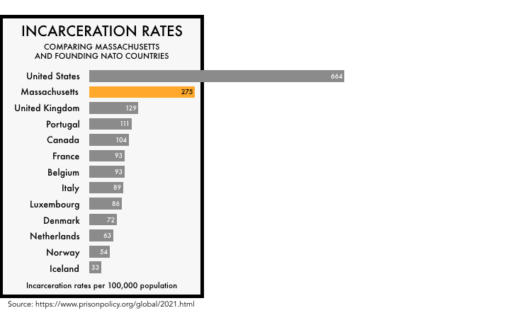


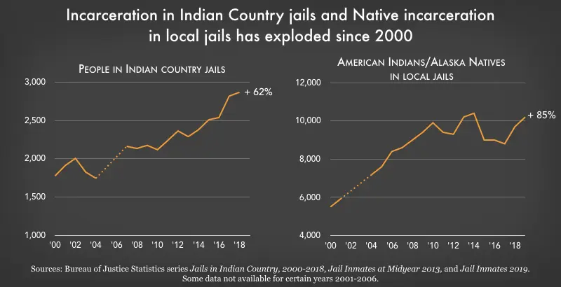
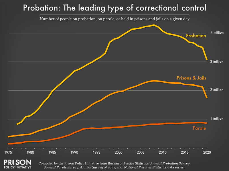