Mapping disadvantage: The geography of incarceration in New York State
By Prison Policy Initiative and VOCAL-NY
February 19, 2020
Press release
One of the most important disparities in New York State and New York City has been hiding in plain sight: how many people are incarcerated from different communities.
Using data collected to implement New York State’s historic 2010 law ending prison gerrymandering by counting incarcerated people where they legally reside — at home, rather than in remote prison cells — we are able to, for the first time, provide detailed state-wide data on the places imprisoned1 New Yorkers call home.2 With this report, we offer both an innovative analysis of how incarceration unevenly affects communities across New York, and a model for how other scholars and advocates can use this unique dataset for purposes far beyond redistricting.
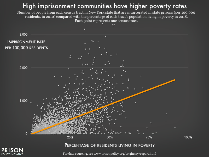
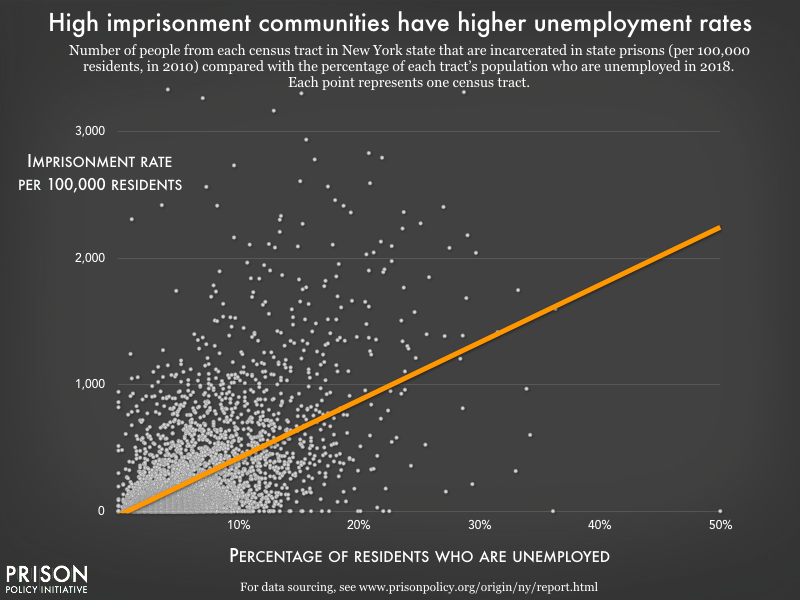
This report shows that a relatively small number of areas in New York are disproportionately impacted by incarceration, and high imprisonment rates correlate with other community problems related to poverty, employment, education, and health.
At a minimum, the correlations we find between imprisonment and other indicators of community well-being show that local imprisonment data are relevant to community discussions about issues beyond public safety and criminal justice. Our findings suggest the need for greater investment in programs and services that prevent criminal justice involvement or mitigate the harm of incarceration. The most obvious conclusion is that New York should expand targeted reentry support for those living in high imprisonment areas, but our methodology and the preliminary findings in this report offer starting points for community leaders, service providers, policymakers, and researchers to learn more about the community impacts of mass incarceration.
Statewide Findings
Imprisoned people come from all over New York State
Most broadly, we find that people in New York state prisons come from every corner of the state. Every single county in the state — and every Assembly and Senate district — is missing a portion of its population to incarceration in state prison. The affluent suburbs of Putnam County had 47 of nearly 100,000 residents in state prison in 2010. By contrast, Albany County holds the highest incarceration rate in the state, with 1,326 residents — or 434 per 100,000 — in state prisons.
The idea that incarceration is a problem unique to urban areas is a myth, and this residence data shows that upstate community leaders should be worried about incarceration, too. A number of less populous areas, such as Chemung, Genesee, Orleans, and Washington counties, rank in the top third of all counties when it comes to prison incarceration rates. Meanwhile, Queens County residents are incarcerated at a lower rate than 35 less populous counties.
Imprisonment becomes endemic in some communities
While incarceration affects every part of the state, it tends to be concentrated in a relatively small number of geographic areas. Over half of everyone in state prison from Albany, for example, hail from just three of Albany’s 15 Common Council wards, which comprise most of the older, predominantly Black neighborhoods on the eastern side of the city along the Hudson River. Across the city, Ward 15 had only 3 residents in state prisons, whereas Ward 3 (north of the capitol building) had 206 residents in state prisons in 2010. People in Ward 3 are 67 times more likely to be imprisoned than the residents of District 15.
While all communities are missing some of their members to imprisonment, in places where large numbers of adults (parents, workers, voters) are locked up, incarceration has a broader community impact. The large number of adults drained from a relatively small number of geographical areas seriously impacts the structure and stability of the families and communities left behind.
None of this is surprising; the relationship between incarceration and what sociologists call “concentrated disadvantage”5 is well documented by others.6 But for this report, we were able to provide hard numbers for these community experiences — and for a wide range of geographically-defined communities.
Local rates of poverty and unemployment are strongly linked to local imprisonment rates
Statewide, we looked at the relationships between incarceration and major economic indicators, and find that:
Figures 1 & 2. Illustrating how local level imprisonment data can spark further investigations of who is most impacted by incarceration, we graph the portion of each census tract7 in New York State that was below the poverty line in 2018 and unemployed in 2018 against the imprisonment rate for that census tract as of 2010. Statewide, we see that imprisonment is closely correlated with poverty and unemployment. The orange line — the trend line — illustrates that every additional 1% of the population in poverty correlates to an increase of 18 more people to the imprisonment rate; for every additional 1% unemployed, the imprisonment rate increases by 46 more people.8 (The graph only includes tracts that had at least 100 people. For the data on all tracts, see our Census Tracts appendix.)
What do these relationships look like on the ground? A stark example is found in two adjacent neighborhoods in northeast Buffalo.9 North of Amherst St., in the Starin Central neighborhoods 10.4% of the population fall below the poverty line, 6.7% are unemployed, and only 8 residents were in state prison in 2010. Immediately south of this area is the Leroy neighborhood, where 43.2% of residents live in poverty and 10% are unemployed. This neighborhood, while less populous, was missing 59 of its residents to state prisons in 2010. The difference between these neighborhood imprisonment rates (146 versus 1,449 per 100,000) is even more extreme than we would expect based on the statewide trend. These neighborhoods illustrate how strongly economic indicators and incarceration are related.
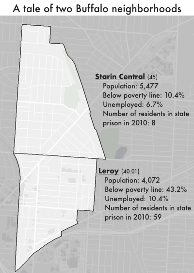
Figure 3. Two neighborhoods in northeastern Buffalo — Starin Central and Leroy — have two things in common: opposite sides of Amherst Street and a correlation between imprisonment and both poverty and unemployment rates.
Our findings support previous research that finds strong links between both poverty and incarceration10 and incarceration and unemployment.11 But these data allow us to look more closely at what these problems look like at the community level, rather than viewing them as simply individual failures or hardships. In turn, they enable us to consider solutions that can positively impact everyone in the communities hit hardest by poverty, unemployment, and incarceration.
Focusing on New York City
Beyond the economic indicators available statewide, New York City makes detailed data available on education and health, which allows us to see how incarceration overlaps with these critical indicators of community wellbeing. (In this way, New York City serves as an excellent example of how jurisdictions that already analyze detailed data on community wellbeing would benefit from residence data on incarcerated people.)
Imprisonment and education: Test scores are strongly related to neighborhood imprisonment rates
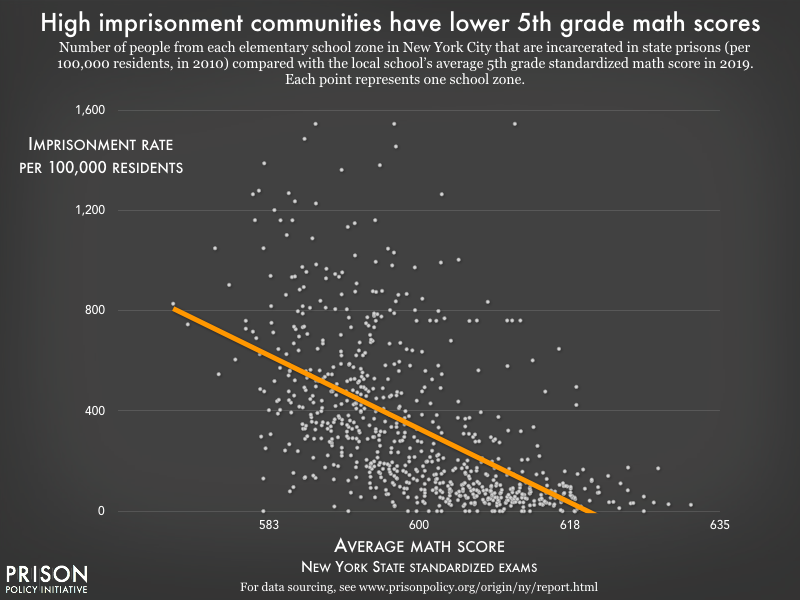
Elementary school zones are the smallest approximation of individual neighborhoods and therefore show some of the most detailed community-level data on the overlap between incarceration and other community disadvantages.12 For example, standardized test scores vary greatly among school zones, and our analysis shows that average scores are incredibly strong predictors of neighborhood imprisonment rates.13
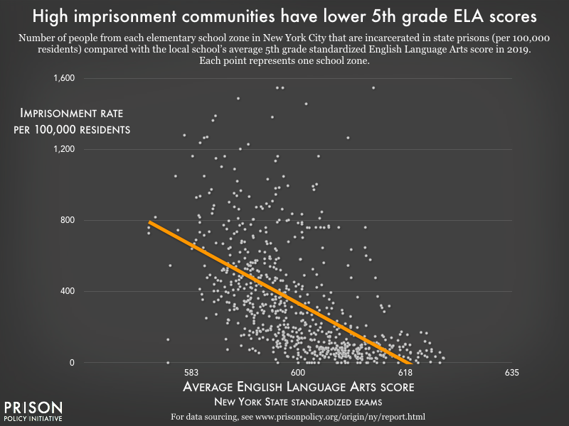
Figures 4 & 5. Elementary school districts are the smallest approximation of individual New York City neighborhoods and therefore show the most detailed community-level data on the overlap between imprisonment and community disadvantage. The orange line — the trend line — illustrates the strong correlation between increasing math and ELA scores and decreasing imprisonment rate. For the average standardized test scores in each NYC public elementary school zone, see our Elementary School Zones appendix.
As the graph above shows, scores on the 5th grade standardized math test have an inverse relationship with imprisonment rates: For every 10 points higher students averaged on the test in a given school zone, the imprisonment rate decreases by nearly 150 people per 100,000 in the same area. Our analysis confirms existing research14 that youth in communities with high imprisonment rates face systemic challenges that extend into their education attainment/academic achievement, as measured by these standardized tests.
Average 5th grade English language arts (ELA) scores show a similar, if slightly more dramatic, correlation to neighborhood imprisonment rates (shown in the graph below). For every 10 points higher students averaged in a school zone, the imprisonment rate decreases by nearly 160 people per 100,000 in the area.
Again, this finding is consistent with previous research on the relationship between education and imprisonment rates. We previously reported that the high school educations of over half of all formerly incarcerated people were cut short. This is in line with earlier studies showing that people in prison have markedly lower educational attainment, literacy, and numeracy than the general public, and are more likely to have learning disabilities.15 The Bureau of Justice Statistics (BJS) has also finds that family characteristics that directly relate to neighborhood incarceration and poverty rates — such as having parents who were ever incarcerated or received welfare, or having lived in public housing — correlate with lower educational attainment among people in state prisons. While the BJS study treats these factors as individual characteristics, our data indicate similar relationships between poverty, imprisonment, and educational outcomes at the community level.
To disrupt the cycle of poverty and incarceration, schools in high-imprisonment neighborhoods should be top priorities for funding and development. And because these are the neighborhoods more people return to after prison — many still with educational needs — agencies providing adult education opportunities should target outreach to these returning community members. Such support will help give them the best chance of success at reentry.
Imprisonment and community health: The example of asthma and imprisonment in Neighborhood Tabulation Areas
Residents of high-imprisonment neighborhoods in New York City are also likely to suffer disproportionately from health problems. Using the residence data, it’s possible to compare the number of residents incarcerated from different Neighborhood Tabulation Areas (NTAs)16 to the prevalence of health problems such as asthma.
We found a strong correlation between asthma rates among children17 and incarceration: in neighborhoods where people were imprisoned at higher rates, public school health records indicate that children in those neighborhoods are more likely to have asthma.
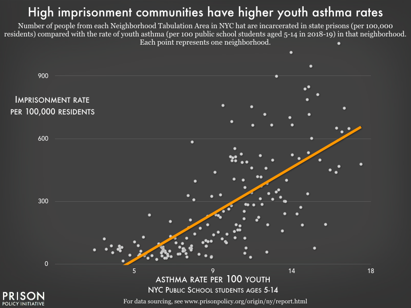
The correlation with asthma is even stronger than the statewide poverty and unemployment correlations discussed above: For every additional 1% of residents who had asthma in the past year in a given neighborhood, the imprisonment rate increases by 49 people (per 100,000).
On the extreme end is Brownsville, Brooklyn, where over 1,050 per 100,000 residents were incarcerated in state prisons in 2010, and over 16% of public school children have active asthma. East and Central Harlem South, Stuyvesant Heights (Brooklyn), and East New York also have high rates of both imprisonment and asthma. In contrast, the Stuyvesant Town-Cooper Village area in Manhattan had only 3 residents in state prison in 2010 and less than 4% of public elementary school students have asthma. Other neighborhoods with low imprisonment and low asthma rates include West Brighton and Bensonhurst West.
| Imprisonment and asthma by neighborhood | ||||||
|---|---|---|---|---|---|---|
| Low imprisonment/low asthma neighborhoods | High imprisonment/high asthma neighborhoods |
|||||
| Neighborhood | Asthma rate | Imprisonment rate | Neighborhood | Asthma rate | Imprisonment rate | |
| Stuyvesant - Cooper (MN50) | 39 | 14 | Central Harlem North-Polo Grounds (MN03) | 135 | 1,013 | |
| Brooklyn Heights-Cobble Hill (BK09) | 58 | 22 | Brownsville (BK81) | 162 | 1,056 | |
| Fresh Meadows-Utopia (QN41) | 63 | 28 | Hunts Point (BX27) | 96 | 759 | |
This correlative finding is again in line with previous research on health disparities across communities, which have been linked to neighborhood factors such as income inequality, exposure to violence, and environmental hazards that disproportionately affect communities of color.18 Public health experts consider community-level factors such as these — including incarceration — “social determinants of health.” To counteract these problems, they suggest taking a broad approach, addressing the “upstream” economic and social disparities through policy as well as improving access to clinical health care.19
While the correlation between asthma and imprisonment rates does not, in and of itself, suggest that incarceration causes community health problems, plenty of previous research does make that argument. Incarcerated populations report health problems at higher rates than the general population, and many of these problems are not adequately addressed by jail and prison health care providers. Infections can progress and/or be transmitted to others while incarcerated, and again upon release, if people are not connected with appropriate treatment. Incarceration also causes stress to both incarcerated people and their families, which in turn can cause or exacerbate health problems.20
Correlations between imprisonment and local health indicators underscore the need for continuity of care when people return home from prison. For reentry service providers in high-imprisonment areas, quickly connecting clients with health services should be a top priority. Similarly, health care providers serving these areas should consider the impact of incarceration on both individual and community health.
Implications & uses of this data
This dataset and the analysis modeled here have great potential for reentry policy, for community advocates, and for future research.
For reentry
The most obvious use of these data, which show us exactly where people incarcerated in state prisons come from, is to help coordinate reentry services, which are typically provided by nonprofit community organizations. These organizations rarely, if ever, have the benefit of this kind of local-level data about the populations they serve,21 although it is possible for any state where prisons collect and maintain complete electronic records to provide it. Knowing both which neighborhoods to target for outreach and what the conditions are in those neighborhoods could make their work more efficient and effective.
For community advocates
In communities where the state or city has heavily invested in policing and incarceration (i.e. the high-incarceration neighborhoods we find in our analysis), our findings suggest that those resources would be better put toward reducing poverty and improving local health, education, and employment opportunities. Particularly as New York continues to reduce its reliance on incarceration — and therefore reduce the cost of incarceration to the state — any savings should be reinvested in the communities hit hardest by incarceration and criminalization.22 To that end, these data can help with need-based decisions about resource allocation in these communities.
For future research
Finally, in states where incarcerated people are re-allocated to their home addresses for redistricting purposes, our methodology unlocks possibilities for further research. In New York, the same analysis can be replicated with new Census data in 2021. It can also be adapted to investigate other correlates of incarceration in variously defined geographical areas. In New York City, for example, researchers can compare local incarceration data to a number of different geographies for which detailed social indicator data is already widely available. And in other, less data-rich parts of the country, incarceration can be compared to common measures such as poverty and employment status. Additionally, demographic characteristics, such as race, ethnicity, and sex, can be added to the analysis.
For other areas, residence data for incarcerated people may not be available or accessible. Advocates and policymakers in these places should push for complete data collection and electronic recordkeeping in their states’ prison systems. The New York residence data are available because the state passed a law ending prison gerrymandering — that is, reallocating incarcerated people to their home addresses for redistricting purposes. While the purpose of such laws is to make electoral districts more representative, the reallocation process requires that reliable address data be collected on intake and then published. Improved data for criminal justice and social science purposes is a welcome side effect.
Methodology & data
This report capitalizes on the unique opportunity presented by New York State’s law ending prison gerrymandering to describe where people incarcerated in state prisons come from. We aggregate this data by a number of useful state-wide geographies such as counties, legislative districts, and cities and explore some basic correlations between where incarcerated people reside and other indicators of social distress in those areas. Additionally, it provides the data for some urban geographies, like many cities’ council districts; and some geographies specifically relevant to New York City, such as health and school districts. (See the appendices for the counts of incarcerated people by 21 state or local geographies.)
This section of the report discusses how we processed the data, and what we are making available to other researchers and advocates. The goal of this report is not to have the final word on the geographic concentration of incarceration, but to empower researchers and advocates — within the field of criminal justice research and without — to use our dataset for their own purposes. For example, if you are an expert on a particular kind of social disadvantage and have some data organized by county, or zipcode, or elementary school district, etc. and want to add imprisonment data to your dataset, we probably have exactly what you need in a prepared appendix described below.
This report and its data — and a similar report and dataset we produced about Maryland — should also be seen as a template for replication in other states. As of this writing seven states — California, Delaware, Maryland, New Jersey, New York, Nevada and Washington — have committed themselves to ending prison gerrymandering and will be producing similar datasets after the 2020 Census. In addition, most states already have mostly complete home residence records in an electronic format.25 Those states should be encouraged to continue to improve their data collection and to share the data under appropriate privacy protections.
About the counts of imprisoned people
New York’s law ending prison gerrymandering required the Department of Corrections and Community Supervision to share the home addresses of people in state prisons on Census Day with redistricting officials, so that these officials could remove imprisoned people from the redistricting populations reported for the facilities’ locations and properly credit people to their home communities. (The reallocation process is documented in Erika Wood’s report for Dēmos Implementing Reform: How Maryland & New York Ended Prison Gerrymandering.)
State redistricting officials reallocated 46,003 people to home addresses within New York State. They then published their adjusted data for use in state and local redistricting to solve the problem of prison gerrymandering. As a side effect, this groundbreaking dataset allowed researchers to talk in detail for the first time about where incarcerated people came from.
Processing this dataset into the tables used for this report required several steps:
- We downloaded the adjusted New York State redistricting data, released by the New York State Legislative Task Force on Demographic Research and Reapportionment; which contains the state’s entire population with the people incarcerated in state prisons reallocated to their home addresses.
- We then subtracted New York State’s redistricting data from the original Census Bureau PL94-171 redistricting data to produce a file that represented the number of incarcerated people from each census block state-wide.
- We then aggregated these block level counts of incarcerated people to each of the geography types available in the report.
- To calculate imprisonment rates for each geography, we produced a corrected population that shows the Census 2010 population plus the number of incarcerated people from that geography. We then took the number of incarcerated people from that geography, divided it by the corrected total population, and then multiplied it by 100,000 to get an imprisonment rate per 100,000.
Researchers and advocates using this data should be aware of several limitations which were not significant for this project but may impact their reuse of the data. In particular, these tables are a significant undercount of the total number of people who are incarcerated in each geography for two major reasons:
- The legislation focused solely on the New York state prison system, and did not attempt to collect counts of New Yorkers incarcerated in local jails (27,445 in 2014), federal prisons (11,334 in 2014), or other states’ prisons, 26 etc.27
- The legislation could not reallocate 11,807 people because they were either from out-of-state or their address could not be mapped in New York State: 2,433 people from other states, 1,276 people without usable addresses, and 8,098 addresses that were incomplete and not easily fixed.28 (The 2010 law did not give the NYS Department of Corrections and Community Supervision a lot of time to prepare its data collection. Hopefully, with an additional decade of time prepare — and the benefits of being able to collect data at intake — the number of incomplete addresses should continue to fall in 2020 and subsequent Censuses.
About the geographies
We’ve organized the data in this report around several popular geographies as defined by the federal government, by the state, or by individual cities, with the idea that the reader can link our data to the wealth of existing social indicator data already available from other sources.
Unfortunately, the reader may desire data for a specific geography — for example, their own neighborhood, as they conceive of its boundaries—not available on the list below. This may be because there was not a readily accessible and official map that we could use that defined that boundary; however, the reader may discover that other available geographies in our appendix can be easily adapted to their goals. The reader can also duplicate our methodology to produce data for other geographies.
We also want to caution subsequent users of this data that some geographies change frequently and others change rarely, so they should note the vintage of the maps we used to produce each table. For example, county boundaries change very rarely and when they do it is often in extremely small ways. On the other hand, New York City elementary school districts can change a lot every single year so depending on your goals you may or may not be able to use our tables.
Subsequent users of this data should note that one possible weakness in this report is that different data is of different ages. We considered, but declined to, restrict all of our analysis to data from approximately 2010 in order to match the date of our imprisonment data. Doing so would likely have made our correlations stronger because we would be describing different stressors in each community at the same time rather than allowing the forces of gentrification to dilute the correlation. Ultimately, however, we concluded that readers would appreciate an effort to describe their communities with the newest available data. Further, we produced this report with an eye towards repeating it in approximately 2022 when this decade’s data is available. Hopefully, with more timely replication, we will be able to reduce this weakness.
Our primary goal with this project was to establish a template for future research, but we wanted to flag one limitation to our appendices that future studies could lessen: race and ethnicity data. Future researchers who completely replicate our methodology could extend it to also break down the race and ethnicity of imprisoned people from each geographic area and thereby unlock new opportunities for studying how race plays into the geography of incarceration.
About the other data used
This report, as part of its effort to illustrate key correlations between incarceration and other social indicators, brings in several other pieces of information.
Statewide poverty and unemployment data by census tracts. We obtained statewide poverty and unemployment data from the U.S. Census Bureau’s 2018 American Community Survey (ACS). We utilized the 5-year estimates from the ACS, which represent data collected over 5 years and have increased statistical reliability over single-year data.29 This data is available by census tracts, which the Census Bureau defines as small, relatively stable, statistical subdivisions of a county with an average population of 4,000 people. Poverty and unemployment data by tract allows us to analyze the relationship between these economic indicators and imprisonment on a neighborhood-level. For our analysis, illustrated in Figures 1 & 2, we filtered out census tracts with populations of less than 100 residents in 2010. This eliminated the effect of outliers on our data, given the Census Bureau’s target population of between 1,000 and 4,000 residents. The full poverty and unemployment data for all tracts (including those with very small populations) is available in our Census Tracts appendix.
-
Youth asthma prevalence in New York City by Neighborhood Tabulation Areas. Asthma among youth is an indicator of population health, and is correlated with numerous community- and geography-level factors including poverty, air quality, environmental factors like mold or allergens, as well as second-hand smoke. Data collected by the NYC Automated School Health Records system indicates the number of public school children, aged 5-14, with a diagnosis of asthma during the previous school year. Of note, the NYC Department of Health and Mental Hygiene (DHMOH) clarifies that these data are an underrepresentation of true asthma prevalence, since the data only include children enrolled in public schools that report to the DOHMH. Asthma prevalence data (and other public health data) is made publicly available at the NYC Environment and Health Data Portal. For Figure 6 in our report we used updated 2018-19 school year data provided by the Agency Asthma program in the Division of Family and Child Health, which we included in our Neighborhood Tabulation Areas appendix.
These asthma data are organized geographically by Neighborhood Tabulation Areas (NTAs), which service as a tool to analyze data at a small area level. NTAs are aggregations of census tracts created by the NYC Department of City Planning with a minimum population of 15,000. Of note, the minimum population requirement for NTAs leads to combinations of neighborhoods based on geography, rather than by designated boundaries of historical neighborhoods.30
-
Math and English Language Arts scores for New York City by elementary school zones. The city publishes the average scores for each grade in each school from the NYC Department of Education. We choose to focus on 5th grade in part by chance and in part because it allowed us to look at elementary school zones with the largest sample size31 in public elementary schools. Elementary school zones are the smallest approximation of individual neighborhoods and therefore show some of the most detailed community-level data on the overlap between imprisonment and other community disadvantages. Average scores for school zones data is available from the original source above and in our Elementary School Zones appendix. Of note, however, there are a handful of school zones that have more than one elementary school, so for the purposes of our analysis we applied the shared imprisonment rate to each school's unique 5th grade math and ELA scores.
Appendices
This report just includes a sampling of the possible analyses that can be done with this data. So that other advocates and researchers can use the data in new ways, this report makes a count of the number of people in New York state prisons in April 2010 from each of the following geographies available:
Statewide:
- Counties (2010)
- Select cities and villages (2010)
- State Assembly districts (2010)
- State Senate districts (2010)
- Zip codes (2010)
- Census tracts (2010)
New York City
- City Council districts (2012)
- Community districts (2012)
- Community health districts (2009)
- Elementary School Zones (2018-2019)
- Middle School Zone (2018-2019)
- Police precincts (2018)
- United Hospital Fund neighborhoods (2009)
- Neighborhood Tabulation Areas (2019)
- Public Use Microdata Areas (2019)
Next five largest cities & Albany County:
About the organizations
The non-profit, non-partisan Prison Policy Initiative produces cutting edge research to expose the broader harm of mass criminalization, and then sparks advocacy campaigns to create a more just society. In 2002, the organization launched the national movement against prison gerrymandering with the publication of Importing Constituents: Prisoners and Political Clout in New York addressing how using Census Bureau counts of incarcerated people as residents of the prison location diluted the votes of state residents who did not live next to prisons in violation of the state constitutional definition of residence. Since then, New York — and six other states — have used the Prison Policy Initiative’s research to pass laws ending prison gerrymandering.
VOCAL-NY is a statewide grassroots organization working to create healthy and just communities by building power among some of the most marginalized New Yorkers, including low-income people affected by HIV/AIDS, drug use, incarceration, and homelessness. We accomplish this through community organizing, leadership development, advocacy, participatory research, and direct services. By combining issue-specific campaigns that directly benefit the lives of our members with low-threshold harm reduction services, we endeavor to address the problems our members face in both the immediate and long-term.
This report is a collaboration between the Prison Policy Initiative and VOCAL-NY’s Civil Rights Union (CRU) our community organizing and advocacy project that is led by and comprised of people who are directly impacted by incarceration. The overall vision of our criminal justice work is to end mass incarceration, and to make massive investments in housing, public health, education, youth services, and other fundamental community resources.
Footnotes
This report uses the term “imprisoned” to refer to people in state prisons. People held in local jails, federal prisons or other types of facilities are outside the scope of the unique dataset used for this report although, presumably, they are confined in a somewhat similar ratio. ↩
In 2015, we collaborated with the Justice Policy Institute to do a similar report on incarceration in Maryland. These two reports are the first to provide detailed local level data on where incarcerated people come from statewide, but others have previously published reports that focused on individual cities or that provided less detailed data.
For example, previous statewide analysis by the Justice Mapping Center shows residence data for people admitted to or released from state prisons in a given year for almost two dozen states. That project makes those states’ annual admission and release data available at the zip code and census tract levels, most recently mapping 2008-2010 data. Separately, it also mapped the residences of people admitted to state prisons from New York City down to the block level using 2009 data.
More recently, the Vera Institute for Justice Incarceration Trends project mapped prison incarceration rates at the county level based on county of commitment (where individuals were convicted and committed to serve a sentence, not necessarily where they lived) for 35 states using 2015 data. (The project has county of commitment data for at least some counties in as many as 45 states using older data — most recently it covered parts of 45 states using 2013 data.) ↩
Admission data, particularly if it is from a short period of time, may obscure changes over time. Local-level release data is often skewed by the locations of halfway houses and so is less likely to represent the home communities and distribution of residence data for the imprisoned population. ↩
Sampson et al (1997) defined “concentrated disadvantage” in Chicago neighborhoods as the cumulative effects of the number of residents below the poverty line, on public assistance, unemployed, under 18, black, and with female-headed families. Essentially, the disadvantageous factors that influence a specific neighborhood, community, or geographic space. ↩
See MassINC’s 2016 report, The Geography of Incarceration, on how incarceration influences geography and neighborhoods in Boston provides a clear example of this relationship.
For a sample of the extensive research available on how incarceration impacts housing, employment, and schools in neighborhood and communities, see the Community Impact section of our Research Library. ↩
Census tracts are “small, relatively permanent statistical subdivisions of a county or county equivalent and generally have a population size between 1,200 and 8,000 people, with an optimum size of 4,000 people.” They are often a good approximation of neighborhoods or portions of neighborhoods. ↩
Incarceration rates are measured in the number of people locked up per 100,000 of a given population; meanwhile, poverty and unemployment are typically measured as percentage of the total population. ↩
Erie County Census tracts 45 and 40.01, which comprise the Starin Central and Leroy neighborhoods, respectively. See Figure 3. ↩
Our Prisons of Poverty report explores how poverty is inherently linked to incarceration. Following incarceration, people struggle to find housing and when people do find jobs, their post-incarceration income is often significantly below the poverty line, contributing to the cycle of poverty. ↩
For an extensive analysis of employment and incarceration, see our report Out of Prison & Out of Work: Unemployment among formerly incarcerated people. For a literature review of research on post-incarceration employment, see http://cepr.net/images/stories/reports/employment-prisoners-felonies-2016-06.pdf. ↩
While the myth that prisons are being built based on math and/or English scores has been debunked more than once, there is indeed a correlation between test scores and incarceration. But while no states base future prison plans on elementary test scores, this correlation should motivate them to allocate more resources to school districts where more parents and other sources of academic support may be incarcerated. ↩
Standardized test scores, in this context, are used as an indicator of trends between schools in different communities, not as a statement on quality of teachers, intelligence of students, or as a direct predictor of future education outcomes. See the 2001 U.S. Department of Education report on standardized testing for an extensive review of test score validity and alternative measurements. For further reading on the socioeconomic factors influencing standardized test scores, see Why Poor Schools Can’t Win at Standardized Testing and "The increasing impact of socioeconomics and race on standardized academic test scores across elementary, middle, and high school." ↩
See, for example, “Mass incarceration and children’s outcomes: Criminal justice policy is education policy” (Leila Morsy and Richard Rothstein, Economic Policy Institute, December 2016) and “Hidden Consequences: The impact of Incarceration on Dependent Children” (Eric Martin, National Institute of Justice, May 2017). ↩
See Bureau of Justice Statistics, Education and Correctional Populations for educational attainment and related variables of unemployment, income, homelessness, living with someone who received welfare, and previous sentence as a juvenile. See the PIAAC Prison Study (2014) for educational attainment, literacy, numeracy, learning disabilities. Specifically, the 2003 BJS report showed that nationally, 75% of people in state prisons had not completed high school, and 1 in 7 had only an 8th grade education or less. More recent data from the PIAAC Prison Study (2014) found that 51% had entered prison without completing high school (30% “below high school” plus 21% who earned their GED or HS credential in prison), which is much closer to our estimate of 58% using the National Former Prisoner Survey (2008). The PIAAC Prison Study also found that 23% of those surveyed in prisons had ever been diagnosed or identified as having a learning disability, compared to 8% of those in households. This estimate is higher than that reported by the 1997 BJS study (which found 10% of people in state prisons reported a learning disability — still above the national estimate of between 5-9% among the general public.) ↩
Note that the Bureau of Justice Statistics report has education attainment for people in state prisons in Table 11.
These Neighborhood Tabulation Areas (NTAs) are geographies created to help analyze data a local, neighborhood level with a minimum population of 15,000. NTAs were created using whole census tracts and are a valuable summary level with which to analyze Census data. To see this data for some areas of NYC, see Table 1 below. For this data for all NTAs, see our Neighborhood Tabulation Areas appendix. ↩
Asthma prevalence has been used as a tool to measure population health in both sociological and public health research because it is easily correlated with environmental factors, like air quality and triggers (i.e. second hand smoke, mold, dust, cockroaches, dust mites), access to appropriate healthcare, and healthcare literacy. See the American Lung Association’s Public Policy Position for a literature review of the relevant public health research. ↩
See Ghetto miasma; Enough to make you sick?, New York Times, 2003 and Pollution is segregated, too, Washington Post, 2014. And for deeper research on the link between pollution, income, and race, see "Disparities in Distribution of Particulate Matter Emission Sources by Race and Poverty Status." ↩
The National Academy of Medicine has compiled best practices and recommendations for addressing some of these social determinants of health, like improving access to health care. ↩
For a county-level analysis of how incarceration influences community health, see Examining the relationship between U.S. incarceration rates and population health at the county level and for a perspective on how incarceration changes the “health of prisoners, prison-adjacent communities, and local ecosystems from coast to coast”, see America’s Toxic Prisons. ↩
For an example of how this disconnect impacts the reentry process, see Create a Department of Reentry: The city and state must coordinate and overhaul services for people getting out of prison from the NY Daily News. ↩
The Chicago Community Bond Fund makes a similar argument in its report Money for Communities, Not Cages: The Case for Reducing the Cook County Sheriff’s Jail Budget. The authors write, “As Cook County spends less on jailing Black and Brown individuals, the money saved must be used to create security and safety in the form of educational access, physical and mental health services, and employment programs for the communities most targeted by mass criminalization.” (p. 3) ↩
In 2003, the Crime Committee was chaired by Senator Nozzolio (District 54) and Districts 49, 47, 48 and 59 were also on the committee. That same year, the Codes Committee was chaired by Senator Volker (District 59) and Districts 45 and 47 were also on the committee. ↩
See, e.g., In New Census, Home is Where the Vote Should Be, Times Herald Record Feb. 19, 2010; Prison-based Gerrymandering Should be Abolished, The Daily Review, Aug. 7, 2010, ; Jim McGrath, Prison Politics in a New Light, Times Union Aug. 6, 2010; Our View: Don’t Count Prisoners with Voters, Utica Observer Dispatch, Feb. 26, 2010; The Post-Standard Editorial Board, Reform Redistricting in New York, Syracuse.com, June 30, 2010. ↩
For more information about the 1998 Bureau of Justice Statistics survey of correctional data systems that found most state prison systems already had mostly complete electronic records of home addresses, see endnote 143 of Erika Wood’s report for Dēmos Implementing Reform: How Maryland & New York Ended Prison Gerrymandering. ↩
For example, if a New York City resident is incarcerated in New Jersey for an offense committed there, they will not be included in these statistics. Because states are passing this legislation to correct their redistricting data on a state-by-state basis, the only way to properly address this type of issue is with a national solution from the Census Bureau. ↩
Researchers new to criminal justice datasets may want to consult Mass Incarceration 2019: The Whole Pie for an analysis of the many types of correctional facilities and their respective number and sizes in the United States and the Appendix to States of Incarceration: The Global Context 2018 for the size of each type of confined population in each state. ↩
For more information on the geocoding and reallocation process, see page 25 of Erika Wood’s report for Dēmos Implementing Reform: How Maryland & New York Ended Prison Gerrymandering. ↩
2018 statewide poverty and unemployment data obtained from American Community Survey 2018 5-year estimates from: https://data.census.gov. Our poverty data was from table S1701 and the unemployment data was from Table S2301. ↩
For more information about NTAs and to access the NTA shapefiles, see https://www1.nyc.gov/site/planning/data-maps/open-data/dwn-nynta.page ↩
NY state public school enrollment for 5th grade is higher than for all other grades in elementary school. ↩
How to link to specific images and sections
To help readers link to specific images in this report, we created these special urls:
- Figure 1. High imprisonment communities have higher poverty rates
- https://www.prisonpolicy.org/origin/ny/report.html#slideshows/slideshow1/1
- Figure 2. High imprisonment communities have higher unemployment rates
- https://www.prisonpolicy.org/origin/ny/report.html#slideshows/slideshow1/2
- Figure 3. A tale of two Buffalo neighborhoods
- https://www.prisonpolicy.org/origin/ny/report.html#figure3
- Figure 4. High imprisonment communities have lower 5th grade math scores
- https://www.prisonpolicy.org/origin/ny/report.html#slideshows/slideshow2/1
- Figure 5. High imprisonment communities have lower 5th grade ELA scores
- https://www.prisonpolicy.org/origin/ny/report.html#slideshows/slideshow2/2
- Figure 6. High imprisonment communities have higher youth asthma rates
- https://www.prisonpolicy.org/origin/ny/report.html#figure6
- Table 1 Imprisonment and asthma by neighborhood
- https://www.prisonpolicy.org/origin/ny/report.html#table1
- Statewide Findings
- https://www.prisonpolicy.org/origin/ny/report.html#statewide
- Incarceration becomes endemic in some communities
- https://www.prisonpolicy.org/origin/ny/report.html#communities
- A cautionary note about interpreting correlations
- https://www.prisonpolicy.org/origin/ny/report.html#caution
- Local rates of poverty and unemployment are strongly linked to local imprisonment rates
- https://www.prisonpolicy.org/origin/ny/report.html#poverty
- Focusing on New York City
- https://www.prisonpolicy.org/origin/ny/report.html#nyc
- Imprisonment and education: Test scores are strongly related to neighborhood imprisonment rates
- https://www.prisonpolicy.org/origin/ny/report.html#education
- Imprisonment and community health: The example of asthma and imprisonment in Neighborhood Tabulation Areas
- https://www.prisonpolicy.org/origin/ny/report.html#health
- Implications & uses of this data
- https://www.prisonpolicy.org/origin/ny/report.html#implications
- For reentry
- https://www.prisonpolicy.org/origin/ny/report.html#for_reentry
- For community advocates
- https://www.prisonpolicy.org/origin/ny/report.html#for_advocates
- For future research
- https://www.prisonpolicy.org/origin/ny/report.html#for_research
- About New York’s law ending prison gerrymandering
- https://www.prisonpolicy.org/origin/ny/report.html#new_york_law
- Methodology & data
- https://www.prisonpolicy.org/origin/ny/report.html#methodology
- About the counts of imprisoned people
- https://www.prisonpolicy.org/origin/ny/report.html#about_the_counts
- About the geographies
- https://www.prisonpolicy.org/origin/ny/report.html#about_the_geographies
- About the other data used
- https://www.prisonpolicy.org/origin/ny/report.html#about_other_data
- Appendix
- https://www.prisonpolicy.org/origin/ny/report.html#appendix
- To link to a specific footnote, ie fn#1 in the text
- https://www.prisonpolicy.org/origin/ny/report.html#fnref:1
Events
- April 15-17, 2025:
Sarah Staudt, our Director of Policy and Advocacy, will be attending the MacArthur Safety and Justice Challenge Network Meeting from April 15-17 in Chicago. Drop her a line if you’d like to meet up!
Not near you?
Invite us to your city, college or organization.
